纯CSS+svg实现三条横线点击变叉菜单按钮动画
作者:admin 时间:2023-6-15 11:42:42 浏览:本文介绍一款纯CSS实现的三条横线点击变叉菜单动画。
效果图
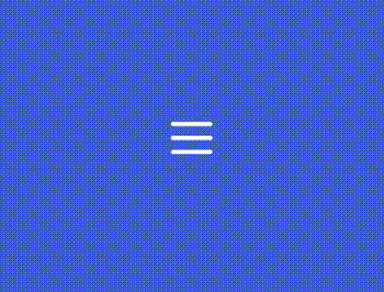
示例介绍
该菜单由纯CSS实现。
该菜单为一款三条横线菜单(汉堡菜单),点击菜单后三条横线变成一个叉(X)。
HTML
<body>
  <div class="container" onclick="this.classList.toggle('active')">
    <svg xmlns="http://www.w3.org/2000/svg" width="150" height="150" viewBox="0 0 200 200">
      <g stroke-width="6.5" stroke-linecap="round">
        <path d="M72 82.286h28.75" fill="#009100" fill-rule="evenodd" stroke="#fff" />
        <path d="M100.75 103.714l72.482-.143c.043 39.398-32.284 71.434-72.16 71.434-39.878 0-72.204-32.036-72.204-71.554" fill="none" stroke="#fff" />
        <path d="M72 125.143h28.75" fill="#009100" fill-rule="evenodd" stroke="#fff" />
        <path d="M100.75 103.714l-71.908-.143c.026-39.638 32.352-71.674 72.23-71.674 39.876 0 72.203 32.036 72.203 71.554" fill="none" stroke="#fff" />
        <path d="M100.75 82.286h28.75" fill="#009100" fill-rule="evenodd" stroke="#fff" />
        <path d="M100.75 125.143h28.75" fill="#009100" fill-rule="evenodd" stroke="#fff" /> </g>
    </svg>
  </div>
</body>
三条横线菜单由svg标签画布画成。
div是菜单容器,div有一个onclick事件,它触发三横线变叉的转换动画。
CSS
三横线
svg {
    transition: transform 500ms cubic-bezier(0.4, 0, 0.2, 1);
}
path {
    transition: transform 500ms cubic-bezier(0.4, 0, 0.2, 1),    stroke-dasharray 500ms cubic-bezier(0.4, 0, 0.2, 1),    stroke-dashoffset 500ms cubic-bezier(0.4, 0, 0.2, 1);
}
path:nth-child(1) {
    transform-origin: 36% 40%;
}
path:nth-child(2) {
    stroke-dasharray: 29 299;
}
path:nth-child(3) {
    transform-origin: 35% 63%;
}
path:nth-child(4) {
    stroke-dasharray: 29 299;
}
path:nth-child(5) {
    transform-origin: 61% 52%;
}
path:nth-child(6) {
    transform-origin: 62% 52%;
}
叉(X)
.active svg {
    transform: rotate(90deg);
}
.active path:nth-child(1) {
    transform: translateX(9px) translateY(1px) rotate(45deg);
}
.active path:nth-child(2) {
    stroke-dasharray: 225 299;
    stroke-dashoffset: -72px;
}
.active path:nth-child(3) {
    transform: translateX(9px) translateY(1px) rotate(-45deg);
}
.active path:nth-child(4) {
    stroke-dasharray: 225 299;
    stroke-dashoffset: -72px;
}
.active path:nth-child(5) {
    transform: translateX(9px) translateY(1px) rotate(-45deg);
}
.active path:nth-child(6) {
    transform: translateX(9px) translateY(1px) rotate(45deg);
}
知识点介绍
本示例 CSS 主要使用了 transition 属性,和 transform 属性,它们实现了图标的转换动画效果。这里介绍一下这两个属性。
CSS transition 属性
transition 属性用于在特定时间段内改变 CSS 属性的值,例如宽度、高度、不透明度和变换。它是其他四个属性的简写属性。
句法
transition: transition-property transition-duration
transition-timing-function transition-delay
上述属性的描述如下:
- transition-property:它用于将过渡设置为任何 CSS 属性,例如宽度、高度、不透明度、变换等等。
- transition-duration:用于调整过渡的持续时间。
- transition-timing-function:用于设置过渡的速度。
- transition-delay:它指定转换何时开始或延迟。
CSS transform 属性
对于 HTML 元素的 2D 和 3D 转换,使用了 CSS 的 transform 属性。通过利用此属性,可以修改元素的形状和大小。它还允许元素旋转、倾斜和缩放。
句法
transform: none|transform-functions
transform属性的描述如下:
- none:用于设置元素不变换。
- transform-function:用于设置变换属性的函数,如
rotate()、skew()、translate()和scale()。此外,scale()函数在水平和垂直方向上调整元素的大小。
总结
本文介绍了纯CSS+svg实现三条横线点击变叉菜单按钮动画,这个菜单在移动网页上很常用,喜欢的朋友可以收藏本页,或者直接下载源码备用。
您可能对以下文章也感兴趣
- jQuery黑色左侧边导航菜单(可折叠可缩进滑出)
- layui框架实现的可折叠侧栏导航菜单(适合信息管理系统)
- 非常受欢迎好看的CSS3水平导航菜单(含二级菜单)
- 一款简易的CSS3侧栏滑动导航菜单
- 很漂亮的 Bootstrap 3 侧栏滑动导航菜单【演示/源码下载】
- 一款漂亮的CSS3蓝色垂直导航菜单
- 二级菜单水平方向排列的CSS3响应式水平导航菜单
- 含二级下拉菜单的CSS3响应式水平导航菜单
- CSS3 PC/移动响应式网页水平导航菜单
- CSS3折叠下拉菜单(深色背景)【演示/源码下载】
相关文章
相关文章
x


