一个具有伸缩(鼠标悬停)效果的CSS按钮
作者:admin 时间:2021-8-11 10:8:19 浏览:本文介绍一个CSS按钮,它具有伸缩(鼠标悬停)效果,即是当鼠标放上时,按钮伸长,当鼠标移开后,按钮缩短。这个效果在很多网页上都挺常见的,它多用于“更多”的按钮设计上。
实例简介
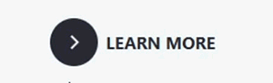
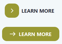
默认状态按钮是实心圆形,内部中间有一个向右的小箭头。
当鼠标移到按钮上时,按钮向右伸长,变成圆角矩形。
当鼠标移开按钮时,按钮又缩回到默认状态。
它多用于“更多”的按钮设计上。
完整HTML代码
<!DOCTYPE html>
<html>

<head>
 <meta charset="UTF-8">
 <title>Css Button Hover</title>

<style>

* {
  box-sizing: border-box;
}
*::before, *::after {
  box-sizing: border-box;
}

body {
  font-family: "Mukta", sans-serif;
  font-size: 1rem;
  line-height: 1.5;
  display: flex;
  align-items: center;
  justify-content: center;
  margin: 0;
  min-height: 100vh;
  background: #f3f8fa;
}

button {
  position: relative;
  display: inline-block;
  cursor: pointer;
  outline: none;
  border: 0;
  vertical-align: middle;
  text-decoration: none;
  background: transparent;
  padding: 0;
  font-size: inherit;
  font-family: inherit;
}
button.learn-more {
  width: 12rem;
  height: auto;
}
button.learn-more .circle {
  transition: all 0.45s cubic-bezier(0.65, 0, 0.076, 1);
  position: relative;
  display: block;
  margin: 0;
  width: 3rem;
  height: 3rem;
  background: #282936;
  border-radius: 1.625rem;
}
button.learn-more .circle .icon {
  transition: all 0.45s cubic-bezier(0.65, 0, 0.076, 1);
  position: absolute;
  top: 0;
  bottom: 0;
  margin: auto;
  background: #fff;
}
button.learn-more .circle .icon.arrow {
  transition: all 0.45s cubic-bezier(0.65, 0, 0.076, 1);
  left: 0.625rem;
  width: 1.125rem;
  height: 0.125rem;
  background: none;
}
button.learn-more .circle .icon.arrow::before {
  position: absolute;
  content: "";
  top: -0.25rem;
  right: 0.0625rem;
  width: 0.625rem;
  height: 0.625rem;
  border-top: 0.125rem solid #fff;
  border-right: 0.125rem solid #fff;
  transform: rotate(45deg);
}
button.learn-more .button-text {
  transition: all 0.45s cubic-bezier(0.65, 0, 0.076, 1);
  position: absolute;
  top: 0;
  left: 0;
  right: 0;
  bottom: 0;
  padding: 0.75rem 0;
  margin: 0 0 0 1.85rem;
  color: #282936;
  font-weight: 700;
  line-height: 1.6;
  text-align: center;
  text-transform: uppercase;
}
button:hover .circle {
  width: 100%;
}
button:hover .circle .icon.arrow {
  background: #fff;
  transform: translate(1rem, 0);
}
button:hover .button-text {
  color: #fff;
}

@supports (display: grid) {
  body {
    display: grid;
    grid-template-columns: repeat(4, 1fr);
    grid-gap: 0.625rem;
    grid-template-areas: ". main main ." ". main main .";
  }

  #container {
    grid-area: main;
    align-self: center;
    justify-self: center;
  }
}
</style>

</head>

<body>

<div id="container">
  <button class="learn-more">
    <span class="circle" aria-hidden="true">
      <span class="icon arrow"></span>
    </span>
    <span class="button-text">Learn More</span>
  </button>
</div>

</body>

</html>
代码解释
1、动画速度可以通过CSS代码改变
transition: all 0.45s cubic-bezier(0.65, 0, 0.076, 1);
0.45s 是定义动画的速度,数值越小速度越快。
2、按钮颜色、大小、圆角等样式设计可通过下面的CSS代码定义
button.learn-more .circle {
  transition: all 0.45s cubic-bezier(0.65, 0, 0.076, 1);
  position: relative;
  display: block;
  margin: 0;
  width: 3rem;
  height: 3rem;
  background: #282936;
  border-radius: 1.625rem;
}
border-radius 是定义按钮圆角大小。background 是定义按钮颜色。
您可能对以下文章也感兴趣
相关文章
x


