CSS3实现渐变/立体/扁平的漂亮按钮
作者:admin 时间:2020-7-13 10:59:40 浏览:网页UI设计追求精美漂亮,除此之外,实现代码也越趋于简单易用。本文就介绍如何用CSS3实现渐变/立体/扁平的漂亮按钮,代码简单易用,但是效果却是十分之好。
CSS3实现渐变/立体/扁平的漂亮按钮
按钮功能
- 易于使用。
- 包含渐变技巧的过渡。
- 未使用任何图像,而是使用base64字符串创建图案效果。
- 分组时修饰按压行为。
按钮
基本上,要创建一个按钮,唯一要做的就是:
<a href="" class="button">Button</a>
或者:
<button class="button">Button</button>
您也可以使用类似方法,<input type="submit">但是为了获得最佳的跨浏览器渲染效果,请坚持上述操作。
css
.button{
  display: inline-block;
  *display: inline;
  zoom: 1;
  padding: 6px 20px;
  margin: 0;
  cursor: pointer;
  border: 1px solid #bbb;
  overflow: visible;
  font: bold 13px arial, helvetica, sans-serif;
  text-decoration: none;
  white-space: nowrap;
  color: #555;
  background-color: #ddd;
  background-image: linear-gradient(top, rgba(255,255,255,1),
                                         rgba(255,255,255,0)),
                    url(data:image/png;base64,iVBORw0KGg[...]QmCC);
  transition: background-color .2s ease-out;
  background-clip: padding-box; /* Fix bleeding */
  border-radius: 3px;
  box-shadow: 0 1px 0 rgba(0, 0, 0, .3),
              0 2px 2px -1px rgba(0, 0, 0, .5),
              0 1px 0 rgba(255, 255, 255, .3) inset;
  text-shadow: 0 1px 0 rgba(255,255,255, .9);
}

.button:hover{
  background-color: #eee;
  color: #555;
}

.button:active{
  background: #e9e9e9;
  position: relative;
  top: 1px;
  text-shadow: none;
  box-shadow: 0 1px 1px rgba(0, 0, 0, .3) inset;
}
不同的按钮尺寸
如果您想使号召性用语更加醒目或不那么醒目,则可以选择以下选项:
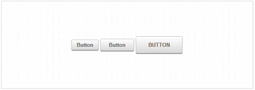
不同的按钮尺寸
<button class="small button">Button</button>
或者
<button class="large button">Button</button>
css
/* Smaller buttons styles */
.button.small{
  padding: 4px 12px;
}

/* Larger buttons styles */
.button.large{
  padding: 12px 30px;
  text-transform: uppercase;
}

.button.large:active{
  top: 2px;
}
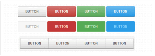
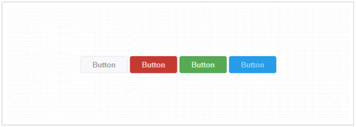
各种按钮颜色
您需要使用自定义颜色才能成功执行操作,也需要使用否定颜色作为删除操作:
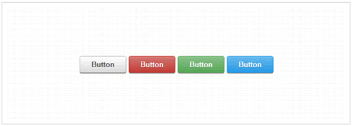
各种按钮颜色
<button class="button">Button</button>
<button class="color red button">Button</button>
<button class="color green button">Button</button>
<button class="color blue button">Button</button>
css
.button.color{
  color: #fff;
  text-shadow: 0 1px 0 rgba(0,0,0,.2);
  background-image: linear-gradient(top, rgba(255,255,255,.3),
             rgba(255,255,255,0)),
                    url(data:image/png;base64,iVBORw0KGg[...]QmCC);
}

/* */

.button.green{
  background-color: #57a957;
  border-color: #57a957;
}

.button.green:hover{
  background-color: #62c462;
}

.button.green:active{
  background: #57a957;
}

/* */

.button.red{
  background-color: #c43c35;
  border-color: #c43c35;
}

.button.red:hover{
  background-color: #ee5f5b;
}

.button.red:active{
  background: #c43c35;
}

/* */

.button.blue{
  background-color: #269CE9;
  border-color: #269CE9;
}

.button.blue:hover{
  background-color: #70B9E8;
}

.button.blue:active{
  background: #269CE9;
}
禁用状态按钮
如果您正在使用按钮或输入,在某些情况下,您将需要禁用它们,直到触发特定任务为止:
禁用状态按钮
<button class="button" disabled>Button</button>
<button class="color red button" disabled>Button</button>
<button class="color green button" disabled>Button</button>
<button class="color blue button" disabled>Button</button>
css
.button[disabled], .button[disabled]:hover, .button[disabled]:active{
  border-color: #eaeaea;
  background: #fafafa;
  cursor: default;
  position: static;
  color: #999;
  /* Usually, !important should be avoided but here it's really needed :) */
  box-shadow: none !important;
  text-shadow: none !important;
}

.green[disabled], .green[disabled]:hover, .green[disabled]:active{
  border-color: #57A957;
  background: #57A957;
  color: #D2FFD2;
}

.red[disabled], .red[disabled]:hover, .red[disabled]:active{
  border-color: #C43C35;
  background: #C43C35;
  color: #FFD3D3;
}

.blue[disabled], .blue[disabled]:hover, .blue[disabled]:active{
  border-color: #269CE9;
  background: #269CE9;
  color: #93D5FF;
}
分组按钮
在某些情况下,您需要将类似的号召性用语按钮分组:
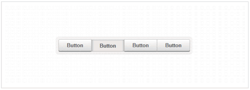
分组按钮
<ul class="button-group">
  <li><button class="button">Button</button></li>
  <li><button class="button">Button</button></li>
  <li><button class="button">Button</button></li>
  <li><button class="button">Button</button></li>
</ul>
css
.button-group,
.button-group li{
  display: inline-block;
  *display: inline;
  zoom: 1;
}

.button-group{
  font-size: 0; /* Inline block elements gap - fix */
  margin: 0;
  padding: 0;
  background: rgba(0, 0, 0, .04);
  border-bottom: 1px solid rgba(0, 0, 0, .07);
  padding: 7px;
  border-radius: 7px;
}

.button-group li{
  margin-right: -1px; /* Overlap each right button border */
}

.button-group .button{
  font-size: 13px; /* Set the font size, different from inherited 0 */
  border-radius: 0;
}

.button-group .button:active{
  box-shadow: 0 0 1px rgba(0, 0, 0, .2) inset,
              5px 0 5px -3px rgba(0, 0, 0, .2) inset,
              -5px 0 5px -3px rgba(0, 0, 0, .2) inset;
}

.button-group li:first-child .button{
  border-radius: 3px 0 0 3px;
}

.button-group li:first-child .button:active{
  box-shadow: 0 0 1px rgba(0, 0, 0, .2) inset,
              -5px 0 5px -3px rgba(0, 0, 0, .2) inset;
}

.button-group li:last-child .button{
  border-radius: 0 3px 3px 0;
}

.button-group li:last-child .button:active{
  box-shadow: 0 0 1px rgba(0, 0, 0, .2) inset,
              5px 0 5px -3px rgba(0, 0, 0, .2) inset;
}
浏览器兼容性
CSS3模式按钮可在所有主要浏览器中使用。但是,当然,此处使用的CSS3功能在IE8及以下版本的浏览器中不起作用。
相关文章推荐
相关文章
x


