使用box-shadow实现的7个按钮悬停效果
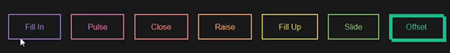
作者:admin 时间:2021-8-11 9:15:3 浏览:本文介绍7个按钮悬停效果,它们是由box-shadow实现的。
box-shadow实现的7个按钮悬停效果
了解 box-shadow
在提供设计代码之前,我们先了解一下box-shadow的语法结构,以便你更方便读懂代码。
box-shadow: [inset?] [top] [left] [blur] [size] [color];
CSS box-shadow 属性用于在元素的框架上添加阴影效果。
你可以在同一个元素上设置多个阴影效果,并用逗号将他们分隔开。该属性可设置的值包括阴影的X轴偏移量、Y轴偏移量、模糊半径、扩散半径和颜色。
你几乎可以在任何元素上使用box-shadow来添加阴影效果。如果元素同时设置了 border-radius 属性 ,那么阴影也会有圆角效果。
语法
/* x偏移量 | y偏移量 | 阴影颜色 */
box-shadow: 60px -16px teal;

/* x偏移量 | y偏移量 | 阴影模糊半径 | 阴影颜色 */
box-shadow: 10px 5px 5px black;

/* x偏移量 | y偏移量 | 阴影模糊半径 | 阴影扩散半径 | 阴影颜色 */
box-shadow: 2px 2px 2px 1px rgba(0, 0, 0, 0.2);

/* 插页(阴影向内) | x偏移量 | y偏移量 | 阴影颜色 */
box-shadow: inset 5em 1em gold;

/* 任意数量的阴影,以逗号分隔 */
box-shadow: 3px 3px red, -1em 0 0.4em olive;

/* 全局关键字 */
box-shadow: inherit;
box-shadow: initial;
box-shadow: unset;
完整HTML代码
<!DOCTYPE html>
<html>

<head>

  <meta charset="UTF-8">

  <title>Button hover effects with box-shadow</title>

<style>

.fill:hover,
.fill:focus {
  box-shadow: inset 0 0 0 2em var(--hover);
}

.pulse:hover,
.pulse:focus {
  -webkit-animation: pulse 1s;
          animation: pulse 1s;
  box-shadow: 0 0 0 2em rgba(255, 255, 255, 0);
}

@-webkit-keyframes pulse {
  0% {
    box-shadow: 0 0 0 0 var(--hover);
  }
}

@keyframes pulse {
  0% {
    box-shadow: 0 0 0 0 var(--hover);
  }
}
.close:hover,
.close:focus {
  box-shadow: inset -3.5em 0 0 0 var(--hover), inset 3.5em 0 0 0 var(--hover);
}

.raise:hover,
.raise:focus {
  box-shadow: 0 0.5em 0.5em -0.4em var(--hover);
  transform: translateY(-0.25em);
}

.up:hover,
.up:focus {
  box-shadow: inset 0 -3.25em 0 0 var(--hover);
}

.slide:hover,
.slide:focus {
  box-shadow: inset 6.5em 0 0 0 var(--hover);
}

.offset {
  box-shadow: 0.3em 0.3em 0 0 var(--color), inset 0.3em 0.3em 0 0 var(--color);
}
.offset:hover, .offset:focus {
  box-shadow: 0 0 0 0 var(--hover), inset 6em 3.5em 0 0 var(--hover);
}

.fill {
  --color: #a972cb;
  --hover: #cb72aa;
}

.pulse {
  --color: #ef6eae;
  --hover: #ef8f6e;
}

.close {
  --color: #ff7f82;
  --hover: #ffdc7f;
}

.raise {
  --color: #ffa260;
  --hover: #e5ff60;
}

.up {
  --color: #e4cb58;
  --hover: #94e458;
}

.slide {
  --color: #8fc866;
  --hover: #66c887;
}

.offset {
  --color: #19bc8b;
  --hover: #1973bc;
}

button {
  color: var(--color);
  transition: 0.25s;
}
button:hover, button:focus {
  border-color: var(--hover);
  color: #fff;
}

body {
  color: #fff;
  background: #17181c;
  font: 300 1em "Fira Sans", sans-serif;
  justify-content: center;
  align-content: center;
  align-items: center;
  text-align: center;
  min-height: 100vh;
  display: flex;
}

button {
  background: none;
  border: 2px solid;
  font: inherit;
  line-height: 1;
  margin: 0.5em;
  padding: 1em 2em;
}

h1 {
  font-weight: 400;
}

code {
  color: #e4cb58;
  font: inherit;
}
</style>


</head>

<body translate="no" >
  <div class="buttons">
  <h1>Simple hover effects with <code>box-shadow</code></h1>
  <button class="fill">Fill In</button>
  <button class="pulse">Pulse</button>
  <button class="close">Close</button>
  <button class="raise">Raise</button>
  <button class="up">Fill Up</button>
  <button class="slide">Slide</button>
  <button class="offset">Offset</button>
</div>


</body>

</html>
代码解释
1、将所有的模糊设置为 0,因为要一个实体填充。
2、添加 inset 关键字,使 box-shadow 位于元素内部。
3、在悬停时动画插入阴影看起来元素正在从你指定的任何一侧填充([top] 和 [left] 接受负值变为 [bottom] 和 [right])。
4、可以堆叠多个阴影。
5、如果你要为多个阴影设置动画,请确保保持相同数量的阴影,以便动画流畅。 否则,你会得到一些断断续续的东西。
您可能对以下文章也感兴趣
标签: box-shadow 悬停效果 按钮 css-shadow
相关文章
x


