漂亮悬停效果的CSS3动画按钮【5个实例代码】
作者:admin 时间:2019-9-19 15:49:18 浏览:本文我想和大家分享一些css3按钮,它们是一些具有不同样式、悬停效果和活动状态的动画链接元素。
CSS3动画按钮
我们将浏览每个示例,看看html结构的外观,以及普通、悬停和活动状态的样式。
请注意,动画/转换(animations/transitions)只在支持css3属性的浏览器中工作,当然,目前主流浏览器都支持css3了。
实例一
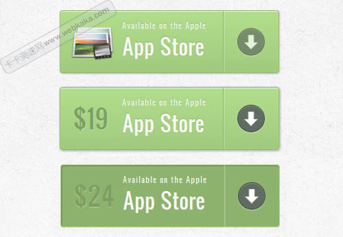
实例一:css3动画按钮
在本例中,我们将创建一个包含多个细节的大按钮。它将有一个图标,一个主文本,右边的箭头和一个只有当我们悬停(hover)时才会出现的价格。
标记
结构非常简单:图标是图像,其他元素是spans:
<a href="#" class="a-btn">
<span class="a-btn-slide-text">$29</span>
<img src="images/icons/1.png" alt="Photos" />
<span class="a-btn-text"><small>Available on the Apple</small> App Store</span>
<span class="a-btn-icon-right"><span></span></span>
</a>
CSS
在样式中,我们将确保在悬停(hover)时要设置动画的元素上设置正确的过渡(transitions)。通过将其不透明度(opacity)设置为0,价格将不可见。应用多框阴影将允许我们创建逼真的效果:
.a-btn{
background: linear-gradient(top, #a9db80 0%,#96c56f 100%);
padding-left: 90px;
padding-right: 105px;
height: 90px;
display: inline-block;
position: relative;
border: 1px solid #80ab5d;
box-shadow:
0px 1px 1px rgba(255,255,255,0.8) inset,
1px 1px 3px rgba(0,0,0,0.2);
border-radius: 4px;
float: left;
clear: both;
margin: 10px 0px;
overflow: hidden;
transition: box-shadow 0.3s ease-in-out;
}
.a-btn img{
position: absolute;
left: 15px;
top: 13px;
border: none;
transition: all 0.3s ease-in-out;
}
.a-btn .a-btn-slide-text{
position: absolute;
font-size: 36px;
top: 18px;
left: 18px;
color: #6d954e;
opacity: 0;
text-shadow: 0px 1px 1px rgba(255,255,255,0.4);
transition: opacity 0.2s ease-in-out;
}
.a-btn-text{
padding-top: 13px;
display: block;
font-size: 30px;
text-shadow: 0px -1px 1px #80ab5d;
}
.a-btn-text small{
display: block;
font-size: 11px;
letter-spacing: 1px;
}
.a-btn-icon-right{
position: absolute;
right: 0px;
top: 0px;
height: 100%;
width: 80px;
border-left: 1px solid #80ab5d;
box-shadow: 1px 0px 1px rgba(255,255,255,0.4) inset;
}
.a-btn-icon-right span{
width: 38px;
height: 38px;
opacity: 0.7;
border-radius: 20px;
position: absolute;
left: 50%;
top: 50%;
margin: -20px 0px 0px -20px;
border: 1px solid rgba(0,0,0,0.5);
background: #4e5c50 url(../images/arrow_down.png) no-repeat center center;
box-shadow: 0px 1px 1px rgba(255,255,255,0.3) inset, 0px 1px 2px rgba(255,255,255,0.5);
transition: all 0.3s ease-in-out;
}
将鼠标悬停(hover)在按钮上时,我们将更改其框阴影,并显示价格和淡出图标:
.a-btn:hover{
box-shadow: 0px 1px 1px rgba(255,255,255,0.8) inset, 1px 1px 5px rgba(0,0,0,0.4);
}
.a-btn:hover img{
transform: scale(10);
opacity: 0;
}
.a-btn:hover .a-btn-slide-text,
.a-btn:hover .a-btn-icon-right span{
opacity: 1;
}
活动状态将使按钮看起来被一个嵌入阴影按下。右侧的箭头图标将放大:
.a-btn:active {
position:relative;
top:1px;
background:#80ab5d;
box-shadow:1px 1px 2px rgba(0,0,0,0.4) inset;
border-color: #a9db80;
}
.a-btn:active .a-btn-icon-right span{
transform: scale(1.4);
}
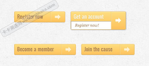
实例二
实例二:css3动画按钮
第二个例子与第一个非常相似,只是我们将添加一些不同的效果。
标记
此示例上的标记与示例1中的标记相同。
CSS
样式几乎与示例1中的样式相同,我们只是调整颜色。但是,我们在悬停时会做些不同的效果。我们将使价格缩放到其原始大小(在我们将其设置为0之前),图标将消失。箭头范围将显示红色背景色:
.a-btn:hover{
box-shadow: 0px 1px 1px rgba(255,255,255,0.8) inset, 1px 1px 5px rgba(0,0,0,0.4);
}
.a-btn:hover img{
opacity: 0;
}
.a-btn:hover .a-btn-slide-text{
opacity: 1;
transform: scale(1);
}
.a-btn:hover .a-btn-icon-right span{
opacity: 1;
background-color: #bc3532;
}
活动状态将与上一个示例中的状态相同。我们只会改变颜色。当我们按下按钮时,我们还将旋转箭头图标:
.a-btn:active {
position: relative;
top: 1px;
background: #5d81ab;
box-shadow: 1px 1px 2px rgba(0,0,0,0.4) inset;
border-color: #80a9da;
}
.a-btn:active .a-btn-icon-right span{
transform: rotate(360deg);
}
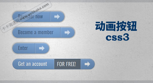
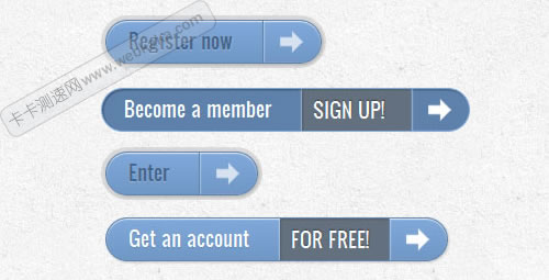
实例三
实例三:css3动画按钮
在这个例子中,我们将尝试一些完全不同的东西。悬停时按钮将向下展开并显示另一条消息。箭头图标将稍微旋转。
标记
示例3中的标记与前面的示例中的标记略有不同。将向下滑动的文本将在“a-btn-slide-text”类的范围内:
<a href="#" class="a-btn">
<span class="a-btn-text">Register now</span>
<span class="a-btn-slide-text">Get a promotion</span>
<span class="a-btn-icon-right"><span></span></span>
</a>
CSS
在正常状态下,按钮将有一个特定的高度,我们将在悬停时设置动画以显示附加消息。“a-btn-slide-text”的附加信息将被绝对定位,我们将在悬停时设置其从0到30px高度的动画。
.a-btn{
background: linear-gradient(top, #feda71 0%,#febb4a 100%);
border: 1px solid #f5b74e;
border-color: #f5b74e #e5a73e #d6982f;
box-shadow: 0 1px 1px #d3d3d3, inset 0 1px 0 #fee395;
padding: 0px 80px 0px 10px;
height: 38px;
display: inline-block;
position: relative;
border-radius: 4px;
float: left;
margin: 10px;
overflow: hidden;
transition: all 0.3s linear;
}
.a-btn-text{
padding-top: 5px;
display: block;
font-size: 18px;
white-space: nowrap;
color: #996633;
text-shadow: 0 1px 0 #fedd9b;
transition: all 0.3s linear;
}
.a-btn-slide-text{
position:absolute;
top: 35px;
left: 0px;
width: auto;
right: 52px;
height: 0px;
background: #fff;
color: #996633;
font-size: 13px;
white-space: nowrap;
font-family: Georgia, serif;
font-style: italic;
text-indent: 15px;
overflow: hidden;
line-height: 30px;
box-shadow: -1px 0px 1px rgba(255,255,255,0.4), 1px 1px 1px rgba(0,0,0,0.5) inset;
transition: height 0.3s linear;
}
.a-btn-icon-right{
position: absolute;
right: 0px;
top: 0px;
height: 100%;
width: 52px;
border-left: 1px solid #f5b74e;
box-shadow: 1px 0px 1px rgba(255,255,255,0.4) inset;
}
.a-btn-icon-right span{
width: 38px;
height: 38px;
opacity: 0.7;
position: absolute;
left: 50%;
top: 50%;
margin: -20px 0px 0px -20px;
background: transparent url(../images/arrow_right.png) no-repeat 50% 55%;
transition: all 0.3s linear;
}
悬停时,我们将更改按钮和其他文本元素的高度。我们还将箭头图标旋转45度:
.a-btn:hover{
height: 65px;
box-shadow: 0px 1px 1px rgba(255,255,255,0.8) inset, 1px 1px 5px rgba(0,0,0,0.4);
}
.a-btn:hover .a-btn-text{
text-shadow: 0px 1px 1px rgba(0,0,0,0.2);
color: #fff;
}
.a-btn:hover .a-btn-slide-text{
height: 30px;
}
.a-btn:hover .a-btn-icon-right span{
opacity: 1;
transform: rotate(-45deg);
}
活动状态将稍微移动按钮并调整颜色,使按钮看起来被按下:
.a-btn:active {
position:relative;
top:1px;
background: linear-gradient(top, #fec354 0%,#fecd61 100%); /* W3C */
border-color: #d29a3a #cc9436 #c89133;
text-shadow: 0 1px 0 #fee1a0;
box-shadow: 0 1px 1px #d4d4d4, inset 0 1px 0 #fed17e;
}
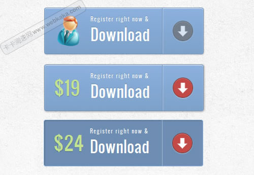
实例四
实例四:css3动画按钮
在示例4中,我们将滑出一些附加消息,就像在前面的示例中一样,但我们将水平滑出到右侧。这看起来像是打开了按钮,显示了里面的信息。
标记
此示例的标记与前一个示例中的标记相同。
CSS
与前面的示例类似,按钮样式如下。我们将更改的是附加文本元素的颜色和位置:
.a-btn{
background: linear-gradient(top, #80a9da 0%,#6f97c5 100%);
padding-left: 20px;
padding-right: 80px;
height: 38px;
display: inline-block;
position: relative;
border: 1px solid #5d81ab;
box-shadow:
0px 1px 1px rgba(255,255,255,0.8) inset,
1px 1px 3px rgba(0,0,0,0.2),
0px 0px 0px 4px rgba(188,188,188,0.5);
border-radius: 20px;
float: left;
clear: both;
margin: 10px 0px;
overflow: hidden;
transition: all 0.3s linear;
}
.a-btn-text{
padding-top: 5px;
display: block;
font-size: 18px;
white-space: nowrap;
text-shadow: 0px 1px 1px rgba(255,255,255,0.3);
color: #446388;
transition: all 0.2s linear;
}
.a-btn-slide-text{
position:absolute;
height: 100%;
top: 0px;
right: 52px;
width: 0px;
background: #63707e;
text-shadow: 0px -1px 1px #363f49;
color: #fff;
font-size: 18px;
white-space: nowrap;
text-transform: uppercase;
text-align: left;
text-indent: 10px;
overflow: hidden;
line-height: 38px;
box-shadow:
-1px 0px 1px rgba(255,255,255,0.4),
1px 1px 2px rgba(0,0,0,0.2) inset;
transition: width 0.3s linear;
}
.a-btn-icon-right{
position: absolute;
right: 0px;
top: 0px;
height: 100%;
width: 52px;
border-left: 1px solid #5d81ab;
box-shadow: 1px 0px 1px rgba(255,255,255,0.4) inset;
}
.a-btn-icon-right span{
width: 38px;
height: 38px;
opacity: 0.7;
position: absolute;
left: 50%;
top: 50%;
margin: -20px 0px 0px -20px;
background: transparent url(../images/arrow_right.png) no-repeat 50% 55%;
transition: all 0.3s linear;
}
悬停时,我们将增加按钮的右填充以及“a-btn-slide-text”范围的宽度:
.a-btn:hover{
padding-right: 180px;
box-shadow: 0px 1px 1px rgba(255,255,255,0.8) inset, 1px 1px 3px rgba(0,0,0,0.2);
}
.a-btn:hover .a-btn-text{
text-shadow: 0px 1px 1px #5d81ab;
color: #fff;
}
.a-btn:hover .a-btn-slide-text{
width: 100px;
}
.a-btn:hover .a-btn-icon-right span{
opacity: 1;
}
活动状态将在插入阴影和向下附加像素的帮助下再次显示为按下状态:
.a-btn:active {
position: relative;
top: 1px;
background: #5d81ab;
box-shadow: 1px 1px 2px rgba(0,0,0,0.4) inset;
border-color: #80a9da;
}
实例五
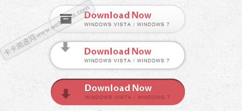
实例五:css3动画按钮
在本例中,我们将使用图标的符号字体。其目的是使显示的图标消失,并在悬停时显示箭头动画。
标记
该结构将由按钮链接内部的4个跨度元素组成。带有“a-btn-slide-icon”类的跨度将是从上到下移动的动画箭头。
<a href="#" class="a-btn">
<span class="a-btn-symbol">Z</span>
<span class="a-btn-text">Download Now</span>
<span class="a-btn-slide-text">Windows Vista / Windows 7</span>
<span class="a-btn-slide-icon"></span>
</a>
CSS
由于我们将使用一种字体来显示左侧的图标,我们将不得不包括字体。
我们将通过将箭头的最大值设置为-30px来隐藏箭头。
@font-face {
font-family: 'WebSymbolsRegular';
src: url('websymbols/websymbols-regular-webfont.eot');
src: url('websymbols/websymbols-regular-webfont.eot?#iefix') format('embedded-opentype'),
url('websymbols/websymbols-regular-webfont.woff') format('woff'),
url('websymbols/websymbols-regular-webfont.ttf') format('truetype'),
url('websymbols/websymbols-regular-webfont.svg#WebSymbolsRegular') format('svg');
font-weight: normal;
font-style: normal;
}
.a-btn{
border-radius: 50px;
padding: 10px 30px 10px 70px;
position: relative;
float:left;
display: block;
overflow: hidden;
margin: 10px;
background: linear-gradient(top, rgba(255,255,255,1) 0%,rgba(246,246,246,1) 74%,rgba(237,237,237,1) 100%);
box-shadow:
0px 0px 7px rgba(0,0,0,0.2),
0px 0px 0px 1px rgba(188,188,188,0.1);
transition: box-shadow 0.3s ease-in-out;
}
.a-btn-symbol{
font-family: 'WebSymbolsRegular', cursive;
color: #555;
font-size: 20px;
text-shadow: 1px 1px 2px rgba(255,255,255,0.5);
position:absolute;
left: 20px;
line-height: 32px;
transition: opacity 0.3s ease-in-out;
}
.a-btn-text{
font-size: 20px;
color: #d7565b;
line-height: 16px;
font-weight: bold;
font-family: "Myriad Pro", "Trebuchet MS", sans-serif;
text-shadow: 1px 1px 2px rgba(255,255,255,0.5);
display: block;
}
.a-btn-slide-text{
font-family: Arial, sans-serif;
font-size: 10px;
letter-spacing: 1px;
text-transform: uppercase;
color: #555;
text-shadow: 0px 1px 1px rgba(255,255,255,0.9);
}
.a-btn-slide-icon{
position:absolute;
top:-30px;
width: 22px;
height: 22px;
background: transparent url(../images/arrow_down_black.png) no-repeat top left;
left:20px;
opacity: 0.4;
}
悬停时,我们将淡出左侧的图标并无限播放箭头的动画:
.a-btn:hover{
background: #fff;
box-shadow:
0px 0px 9px rgba(0,0,0,0.4),
0px 0px 0px 1px rgba(188,188,188,0.1);
}
.a-btn:hover .a-btn-symbol{
opacity: 0;
}
.a-btn:hover .a-btn-slide-icon{
-webkit-animation: slideDown 0.9s linear infinite;
}
当按下按钮时,我们将使按钮变红,并通过给它一个嵌入阴影使其看起来被按下:
.a-btn:active{
background: #d7565b;
box-shadow:
0px 2px 2px rgba(0,0,0,0.6) inset,
0px 0px 0px 1px rgba(188,188,188,0.1);
}
.a-btn:active .a-btn-text{
color: #fff;
text-shadow: 0px 1px 1px rgba(0,0,0,0.3);
}
.a-btn:active .a-btn-slide-text{
color: rgba(0,0,0,0.4);
text-shadow: none;
}
最后,是从上到下移动箭头的简单动画:
@keyframes slideDown {
0% { top: -30px; }
100% { top: 80px;}
}
相关文章


