漂亮的纯CSS3开关按钮 (UISwitch)
作者:admin 时间:2020-7-11 9:9:20 浏览:UISwitch(开关按钮)是APP应用程序中不可缺少的一个UI设计元素,事实上,这个UI设计同样可以移植到任何网页设计中,无论是PC端还是移动端的网页,它可以让网页看起来更有设计感,让用户的视觉感官更加强烈。
本文将介绍纯CSS3实现的漂亮的开关按钮 (UISwitch)。
纯CSS3开关按钮 (UISwitch)
css代码
.uiswitch {
    -webkit-box-sizing: border-box;
    -moz-box-sizing: border-box;
    box-sizing: border-box;
    -webkit-appearance: none;
    -moz-appearance: none;
    -ms-appearance: none;
    -o-appearance: none;
    appearance: none;
    -webkit-user-select: none;
    -moz-user-select: none;
    -ms-user-select: none;
    user-select: none;
    height: 31px;
    width: 51px;
    position: relative;
    border-radius: 16px;
    cursor: pointer;
    outline: 0;
    z-index: 0;
    margin: 0;
    padding: 0;
    border: none;
    background-color: #e5e5e5;
    -webkit-transition-duration: 600ms;
    -moz-transition-duration: 600ms;
    transition-duration: 600ms;
    -webkit-transition-timing-function: ease-in-out;
    -moz-transition-timing-function: ease-in-out;
    transition-timing-function: ease-in-out;
    -webkit-touch-callout: none;
    -webkit-text-size-adjust: none;
    -webkit-tap-highlight-color: rgba(0, 0, 0, 0);
    -webkit-user-select: none;
}

.uiswitch::before {
    -webkit-box-sizing: border-box;
    -moz-box-sizing: border-box;
    box-sizing: border-box;
    height: 27px;
    width: 47px;
    content: ' ';
    position: absolute;
    left: 2px;
    top: 2px;
    background-color: #ffffff;
    border-radius: 16px;
    z-index: 1;
    -webkit-transition-duration: 300ms;
    -moz-transition-duration: 300ms;
    transition-duration: 300ms;
    -webkit-transform: scale(1);
    -moz-transform: scale(1);
    -ms-transform: scale(1);
    -o-transform: scale(1);
    transform: scale(1);
}

.uiswitch::after {
    -webkit-box-sizing: border-box;
    -moz-box-sizing: border-box;
    box-sizing: border-box;
    height: 27px;
    width: 27px;
    content: ' ';
    position: absolute;
    border-radius: 27px;
    background: #ffffff;
    z-index: 2;
    top: 2px;
    left: 2px;
    box-shadow: 0px 0px 1px 0px rgba(0, 0, 0, 0.25), 0px 4px 11px 0px rgba(0, 0, 0, 0.08), -1px 3px 3px 0px rgba(0, 0, 0, 0.14);
    -webkit-transition: -webkit-transform 300ms, width 280ms;
    -moz-transition: -moz-transform 300ms, width 280ms;
    transition: transform 300ms, width 280ms;
    -webkit-transform: translate3d(0, 0, 0);
    -moz-transform: translate3d(0, 0, 0);
    -ms-transform: translate3d(0, 0, 0);
    -o-transform: translate3d(0, 0, 0);
    transform: translate3d(0, 0, 0);
    -webkit-transition-timing-function: cubic-bezier(0.42, 0.8, 0.58, 1.2);
    -moz-transition-timing-function: cubic-bezier(0.42, 0.8, 0.58, 1.2);
    transition-timing-function: cubic-bezier(0.42, 0.8, 0.58, 1.2);
}

.uiswitch:checked {
    background-color: #4CD964;
    background-image: -webkit-linear-gradient(-90deg, #4CD964 0%, #4dd865 100%);
    background-image: linear-gradient(-180deg,#4CD964 0%, #4dd865 100%);
}

.uiswitch:checked::after {
    -webkit-transform: translate3d(16px, 0, 0);
    -moz-transform: translate3d(16px, 0, 0);
    -ms-transform: translate3d(16px, 0, 0);
    -o-transform: translate3d(16px, 0, 0);
    transform: translate3d(16px, 0, 0);
    right: 18px;
    left: inherit;
}

.uiswitch:active::after {
    width: 35px;
}

.uiswitch:checked::before, .uiswitch:active::before {
    -webkit-transform: scale(0);
    -moz-transform: scale(0);
    -ms-transform: scale(0);
    -o-transform: scale(0);
    transform: scale(0);
}

.uiswitch:disabled {
    opacity: 0.5;
    cursor: default;
    -webkit-transition: none;
    -moz-transition: none;
    transition: none;
}

.uiswitch:disabled:active::before, .uiswitch:disabled:active::after, .uiswitch:disabled:checked:active::before, .uiswitch:disabled:checked::before {
    width: 27px;
    -webkit-transition: none;
    -moz-transition: none;
    transition: none;
}

.uiswitch:disabled:active::before {
    height: 27px;
    width: 41px;
    -webkit-transform: translate3d(6px, 0, 0);
    -moz-transform: translate3d(6px, 0, 0);
    -ms-transform: translate3d(6px, 0, 0);
    -o-transform: translate3d(6px, 0, 0);
    transform: translate3d(6px, 0, 0);
}

.uiswitch:disabled:checked:active::before {
    height: 27px;
    width: 27px;
    -webkit-transform: scale(0);
    -moz-transform: scale(0);
    -ms-transform: scale(0);
    -o-transform: scale(0);
    transform: scale(0);
}

.uiswitch {
    background-color: #e5e5e5;
}

.uiswitch::before {
    background-color: #ffffff;
}

.uiswitch::after {
    background: #ffffff;
}

.uiswitch:checked {
    background-color: #4CD964;
    background-image: -webkit-linear-gradient(-90deg, #4CD964 0%, #4dd865 100%);
    background-image: linear-gradient(-180deg,#4CD964 0%, #4dd865 100%);
}

body {
    font-family: "Helvetica Neue", Helvetica, Arial, sans-serif;
    background-color: #ffffff;
}

p {
    font-size: 18px;
    font-weight: 300;
}

pre, code {
    font-family: Monaco, Menlo, "Courier New", Courier, monospace;
    font-size: 13px;
}

pre {
    text-align: left;
}

pre {
    background-color: #fbfbfb;
    border: 1px solid #eee;
    padding: .6em;
    display: inline-block;
    border-radius: 3px;
}

.wrapper {
    width: 90%;
    margin: 0 auto;
    text-align: center;
}

h1 {
    font-weight: 200;
    text-align: center;
    margin: 2em;
}

.fields__item {
    display: inline-block;
    margin-right: 1.875em;
    text-align: center;
}

h6 {
    font-size: 12px;
    font-weight: 500;
    text-transform: uppercase;
    letter-spacing: .5px;
    color: #aaa;
    margin: 1em;
}

.section {
    margin: 2em auto;
}

.custom {
    background-color: #eadcbc;
}

.custom::before {
    background-color: #f7f2e5;
}

.custom::after {
    background: #fff3a6;
}

.custom:checked {
    background-color: #ffca3f;
    background-image: -webkit-linear-gradient(-90deg, #ffca3f 0%, #feca40 100%);
    background-image: linear-gradient(-180deg, #ffca3f 0%, #feca40 100%);
}

.my-switch {
    border-radius: 4px;
}

.my-switch::before {
    border-radius: 2px;
}

.my-switch::after {
    border-radius: 1px;
}

.my-switch:checked {
    background: hotpink;
}

.my-switch:checked::after {
    background-color: #333;
}
html代码
<div class="wrapper">
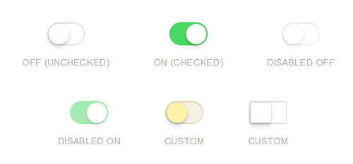
<h1>CSS3 UISwitch Example</h1>
<section id="fields" class="fields section">
<div class="fields__item">
<input type="checkbox" class="uiswitch">
<h6>Off (unchecked)</h6>
</div>
<div class="fields__item">
<input type="checkbox" class="uiswitch" checked>
<h6>On (checked)</h6>
</div>
<div class="fields__item">
<input type="checkbox" class="uiswitch" disabled>
<h6>Disabled Off</h6>
</div>
<div class="fields__item">
<input type="checkbox" class="uiswitch" checked disabled>
<h6>Disabled On</h6>
</div>
<div class="fields__item">
<input type="checkbox" class="uiswitch custom">
<h6>Custom</h6>
</div>
<div class="fields__item">
<input type="checkbox" class="uiswitch my-switch">
<h6>Custom</h6>
</div>
</section>
</div>
使用说明
只需要使用一行html代码,添加uiswitch类名。
<input type="checkbox" class="uiswitch">
可以设置默认值,比如默认选择、默认不可用,那么只需在这行html代码里添加一个属性如checked,disabled即可。
<input type="checkbox" class="uiswitch disabled">希望大家喜欢本教程。
您可能对以下文章也感兴趣
相关文章
x


