【8个实例】纯CSS按钮(button),简单漂亮实用
作者:admin 时间:2020-2-20 20:19:5 浏览:本文介绍6个纯CSS按钮(button)实例,漂亮又实用,代码使用简单,又具有很强的可迁性,基本上在任何一张网页都能很容易就能用上这些按钮样式。
纯CSS按钮(button)
实例1:普通按钮
创建一个普通按钮,只需在<a>或<button>元素添加pure-button类。
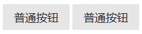
<a class="pure-button" href="#">普通按钮</a>
<button class="pure-button">普通按钮</button>
实例2:不可用按钮(disabled button)
要创建一个不可用按钮,只需在<a>元素里添加pure-button类和pure-button-disabled类,或者在<button>元素里,添加pure-button类,同时添加disabled属性。
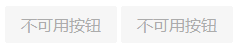
<button class="pure-button pure-button-disabled">不可用按钮</button>
<button class="pure-button" disabled>不可用按钮</button>
实例3:活动按钮(active button)
当你要标识已经点击过的按钮时,可在<a>或<button>元素里添加一个pure-button-active类。
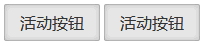
<a class="pure-button pure-button-active" href="#">活动按钮</a>
<button class="pure-button pure-button-active">活动按钮</button>
实例4:主要按钮
当你要显示哪些是主要按钮时,可在<a>或<button>元素里添加一个pure-button-primary类。
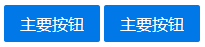
<a class="pure-button pure-button-primary" href="#">主要按钮</a>
<button class="pure-button pure-button-primary">主要按钮</button>
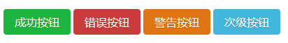
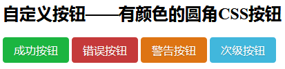
实例5:自定义按钮样式
为了自定义按钮样式,你应该把你的自定义CSS归组到一个类,如button-foo,然后把这个类加到已经加了pure-button类的元素里。这里是一些例子。
<div>
    <style scoped>

        .button-success,
        .button-error,
        .button-warning,
        .button-secondary {
            color: white;
            border-radius: 4px;
            text-shadow: 0 1px 1px rgba(0, 0, 0, 0.2);
        }

        .button-success {
            background: rgb(28, 184, 65); /* this is a green */
        }

        .button-error {
            background: rgb(202, 60, 60); /* this is a maroon */
        }

        .button-warning {
            background: rgb(223, 117, 20); /* this is an orange */
        }

        .button-secondary {
            background: rgb(66, 184, 221); /* this is a light blue */
        }

    </style>

    <button class="button-success pure-button">成功按钮</button>
    <button class="button-error pure-button">错误按钮</button>
    <button class="button-warning pure-button">警告按钮</button>
    <button class="button-secondary pure-button">次级按钮</button>
</div>
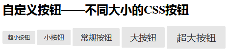
实例6:不同大小的按钮
类似实例5,我们还可以自定义不同大小的按钮样式。
<div>
    <style scoped>

        .button-xsmall {
            font-size: 70%;
        }

        .button-small {
            font-size: 85%;
        }

        .button-large {
            font-size: 110%;
        }

        .button-xlarge {
            font-size: 125%;
        }

    </style>

    <button class="button-xsmall pure-button">超小按钮</button>
    <button class="button-small pure-button">小按钮</button>
    <button class="pure-button">普通按钮</button>
    <button class="button-large pure-button">大按钮</button>
    <button class="button-xlarge pure-button">超大按钮</button>
</div>
实例7:字体图标按钮
字体图标按钮很酷很实用,这里我们要用到Font Awesome字体库文件。
首先要在html代码里引用Font Awesome CSS文件,然后在使用pure-button类的元素里添加一个<i>元素。
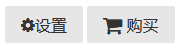
<button class="pure-button">
    <i class="fa fa-cog"></i>
    设置
</button>

<a class="pure-button" href="#">
    <i class="fa fa-shopping-cart fa-lg"></i>
    购买
</a>
注意!字体图标要在Web服务器上做相应配置,才能显示。参考文章:Linux Nginx安装配置Font Awesome图标字体,IIS7.5安装配置Font Awesome图标字体的方法。
实例8:按钮组
一行把多个按钮放在一起。
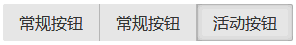
<div class="pure-button-group" role="group" aria-label="...">
    <button class="pure-button">普通按钮</button>
    <button class="pure-button">普通按钮</button>
    <button class="pure-button pure-button-active">活动按钮</button>
</div>
相关文章
x


