一组精致好看的CSS表单样式:checkbox、radio、text等
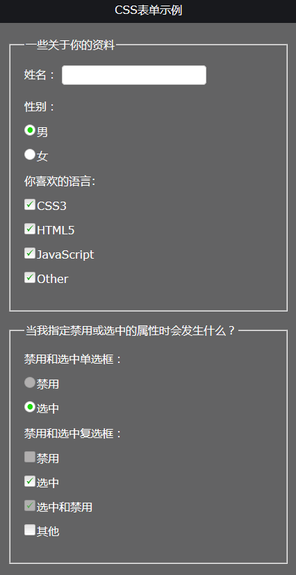
作者:admin 时间:2022-12-13 18:56:34 浏览:一个精致漂亮的网页表单,可让你的网页立即变得上了档次,本文将给你介绍一个精美的CSS表单样式,并提供源文件下载,真正做到即拿即用。
HTML代码
<fieldset>
  <legend>一些关于你的资料</legend>
  <label for="fullname">姓名:</label>
  <input type="text" id="fullname" />
  <p>性别:</p>
  <p>
    <input type="radio" value="male" id="male" name="gender" />
    <label for="male">男</label>
  </p>
  <p>
    <input type="radio" value="Female" id="female" name="gender" />
    <label for="female">女</label>
  </p>
  <p>你喜欢的语言:</p>
  <p>
    <input type="checkbox" value="CSS3" id="css3" />
    <label for="css3">CSS3</label>
  </p>
  <p>
    <input type="checkbox" value="HTML5" id="html5" />
    <label for="html5">HTML5</label>
  </p>
  <p>
    <input type="checkbox" value="JavaScript" id="javascript" />
    <label for="javascript">JavaScript</label>
  </p>
  <p>
    <input type="checkbox" value="Other" id="other" />
    <label for="other">Other</label>
  </p>
</fieldset>
没有什么特别之处,使用的是原始控件(checkbox、radio、text)常规的代码。input加上label控件组合起来排版布局。
CSS代码
因为代码分别为checkbox、radio、text等控件专属,所以总共代码有点多,CSS样式文件包含在下载包里。
/* 选中(Checked)样式 */
p:not(#foo) > input[type=radio]:checked + label  { background-position: 0 -241px; }
p:not(#foo) > input[type=checkbox]:checked + label  { background-position: 0 -81px; }
p:not(#foo) > input[type=checkbox]:hover:checked + label,
p:not(#foo) > input[type=checkbox]:focus:checked + label,
p:not(#foo) > input[type=checkbox]:checked + label:hover,
p:not(#foo) > input[type=checkbox]:focus:checked + label  { background-position: 0 -101px; }
p:not(#foo) > input[type=radio]:hover:checked + label,
p:not(#foo) > input[type=radio]:focus:checked + label,
p:not(#foo) > input[type=radio]:checked + label:hover,
p:not(#foo) > input[type=radio]:focus:checked + label  { background-position: 0 -261px; }

/* 鼠标悬停(hover)和聚焦(focus)样式 */
p:not(#foo) > input[type=checkbox]:hover + label,
p:not(#foo) > input[type=checkbox]:focus + label,
p:not(#foo) > input[type=checkbox] + label:hover  { background-position: 0 -21px; }
p:not(#foo) > input[type=radio]:hover + label,
p:not(#foo) > input[type=radio]:focus + label,
p:not(#foo) > input[type=radio] + label:hover { background-position: 0 -181px; }

/* 活动(active)样式 */
p:not(#foo) > input[type=checkbox]:active + label,
p:not(#foo) > input[type=checkbox] + label:hover:active { background-position: 0 -41px; }
p:not(#foo) > input[type=radio]:active + label,
p:not(#foo) > input[type=radio] + label:hover:active { background-position: 0 -201px; }
p:not(#foo) > input[type=checkbox]:active:checked + label,
p:not(#foo) > input[type=checkbox]:checked + label:hover:active { background-position: 0 -121px; }
p:not(#foo) > input[type=radio]:active:checked + label,
p:not(#foo) > input[type=radio]:checked + label:hover:active { background-position: 0 -281px; }

/* 禁用(disabled)样式 */
p:not(#foo) > input[type=checkbox]:disabled + label,
p:not(#foo) > input[type=checkbox]:hover:disabled + label,
p:not(#foo) > input[type=checkbox]:focus:disabled + label,
p:not(#foo) > input[type=checkbox]:disabled + label:hover,
p:not(#foo) > input[type=checkbox]:disabled + label:hover:active { background-position: 0 -61px; }
p:not(#foo) > input[type=radio]:disabled + label,
p:not(#foo) > input[type=radio]:hover:disabled + label,
p:not(#foo) > input[type=radio]:focus:disabled + label,
p:not(#foo) > input[type=radio]:disabled + label:hover,
p:not(#foo) > input[type=radio]:disabled + label:hover:active { background-position: 0 -221px; }
p:not(#foo) > input[type=checkbox]:disabled:checked + label,
p:not(#foo) > input[type=checkbox]:hover:disabled:checked + label,
p:not(#foo) > input[type=checkbox]:focus:disabled:checked + label,
p:not(#foo) > input[type=checkbox]:disabled:checked + label:hover,
p:not(#foo) > input[type=checkbox]:disabled:checked + label:hover:active { background-position: 0 -141px; }
p:not(#foo) > input[type=radio]:disabled:checked + label,
p:not(#foo) > input[type=radio]:hover:disabled:checked + label,
p:not(#foo) > input[type=radio]:focus:disabled:checked + label,
p:not(#foo) > input[type=radio]:disabled:checked + label:hover,
p:not(#foo) > input[type=radio]:disabled:checked + label:hover:active { background-position: 0 -301px; }
上面为部分代码,完整代码在下载包文件里。
使用注意问题
CSS用到一个图片,使用时应注意路径正确。
p:not(#foo) > input + label
{
  background: url(gr_custom-inputs.png) 0 -1px no-repeat;
  height: 16px;
}
支持浏览器
- Firefox 1.5+
- Opera 9.6+
- Safari 3.2+*
- iPhone/iPod Safari**
- Chrome 4+
- IE9+
相关文章
相关文章
x


