两例纯CSS样式:单选radio/复选checkbox按钮
作者:admin 时间:2022-12-5 16:37:12 浏览:本文介绍两例纯CSS样式:单选radio/复选checkbox按钮。
1、单选(radio)按钮
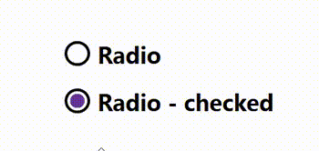
单选(radio)按钮
完整HTML代码
<!DOCTYPE html>
<html>
<head>
  <meta charset="UTF-8">
  <meta name="viewport" content="width=device-width, initial-scale=1">

<style>
:root {
  --form-control-color: rebeccapurple;
}

*,
*:before,
*:after {
  box-sizing: border-box;
}

body {
  margin: 0;
}

form {
  display: grid;
  place-content: center;
  min-height: 100vh;
}

.form-control {
  font-family: system-ui, sans-serif;
  font-size: 2rem;
  font-weight: bold;
  line-height: 1.1;
  display: grid;
  grid-template-columns: 1em auto;
  gap: 0.5em;
}

.form-control + .form-control {
  margin-top: 1em;
}

.form-control:focus-within {
  color: var(--form-control-color);
}

input[type=radio] {
  /* Add if not using autoprefixer */
  -webkit-appearance: none;
  /* Remove most all native input styles */
  -moz-appearance: none;
       appearance: none;
  /* For iOS < 15 */
  background-color: var(--form-background);
  /* Not removed via appearance */
  margin: 0;
  font: inherit;
  color: currentColor;
  width: 1.15em;
  height: 1.15em;
  border: 0.15em solid currentColor;
  border-radius: 50%;
  transform: translateY(-0.075em);
  display: grid;
  place-content: center;
}

input[type=radio]::before {
  content: "";
  width: 0.65em;
  height: 0.65em;
  border-radius: 50%;
  transform: scale(0);
  transition: 120ms transform ease-in-out;
  box-shadow: inset 1em 1em var(--form-control-color);
  /* Windows High Contrast Mode */
  background-color: CanvasText;
}

input[type=radio]:checked::before {
  transform: scale(1);
}

input[type=radio]:focus {
  outline: max(2px, 0.15em) solid currentColor;
  outline-offset: max(2px, 0.15em);
}
</style>

</head>

<body translate="no" >
  <form action="">
  <label class="form-control">
    <input type="radio" name="radio" />
    Radio
  </label>

  <label class="form-control">
    <input type="radio" name="radio" checked />
    Radio - checked
  </label>
</form>

</body>

</html>
代码解释
1、未选中状态的CSS
input[type="radio"] {
  appearance: none;
  background-color: #fff;
  margin: 0;
  font: inherit;
  color: currentColor;
  width: 1.15em;
  height: 1.15em;
  border: 0.15em solid currentColor;
  border-radius: 50%;
  transform: translateY(-0.075em);
}
2、checked状态的CSS
input[type="radio"] {
  /* ...existing styles */
  display: grid;
  place-content: center;
}

input[type="radio"]::before {
  content: "";
  width: 0.65em;
  height: 0.65em;
  border-radius: 50%;
  transform: scale(0);
  transition: 120ms transform ease-in-out;
  box-shadow: inset 1em 1em var(--form-control-color);
}

input[type="radio"]:checked::before {
  transform: scale(1);
}
3、:focus状态的CSS
input[type="radio"]:focus {
  outline: max(2px, 0.15em) solid currentColor;
  outline-offset: max(2px, 0.15em);
}
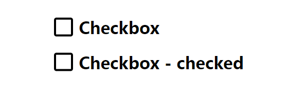
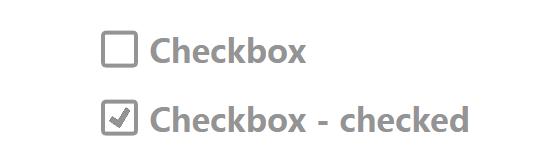
2、复选(checkbox)按钮
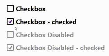
复选(checkbox)按钮
完整HTML代码
<!DOCTYPE html>
<html>
<head>
<meta charset="UTF-8">
<meta name="viewport" content="width=device-width, initial-scale=1">
<style>
:root {
--form-control-color: rebeccapurple;
--form-control-disabled: #959495;
}
*,
*:before,
*:after {
box-sizing: border-box;
}
body {
margin: 0;
}
form {
display: grid;
place-content: center;
min-height: 100vh;
}
.form-control {
font-family: system-ui, sans-serif;
font-size: 2rem;
font-weight: bold;
line-height: 1.1;
display: grid;
grid-template-columns: 1em auto;
gap: 0.5em;
}
.form-control + .form-control {
margin-top: 1em;
}
.form-control--disabled {
color: var(--form-control-disabled);
cursor: not-allowed;
}
input[type=checkbox] {
/* Add if not using autoprefixer */
-webkit-appearance: none;
/* Remove most all native input styles */
-moz-appearance: none;
appearance: none;
/* For iOS < 15 */
background-color: var(--form-background);
/* Not removed via appearance */
margin: 0;
font: inherit;
color: currentColor;
width: 1.15em;
height: 1.15em;
border: 0.15em solid currentColor;
border-radius: 0.15em;
transform: translateY(-0.075em);
display: grid;
place-content: center;
}
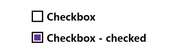
input[type=checkbox]::before {
content: "";
width: 0.65em;
height: 0.65em;
-webkit-clip-path: polygon(14% 44%, 0 65%, 50% 100%, 100% 16%, 80% 0%, 43% 62%);
clip-path: polygon(14% 44%, 0 65%, 50% 100%, 100% 16%, 80% 0%, 43% 62%);
transform: scale(0);
transform-origin: bottom left;
transition: 120ms transform ease-in-out;
box-shadow: inset 1em 1em var(--form-control-color);
/* Windows High Contrast Mode */
background-color: CanvasText;
}
input[type=checkbox]:checked::before {
transform: scale(1);
}
input[type=checkbox]:focus {
outline: max(2px, 0.15em) solid currentColor;
outline-offset: max(2px, 0.15em);
}
input[type=checkbox]:disabled {
--form-control-color: var(--form-control-disabled);
color: var(--form-control-disabled);
cursor: not-allowed;
}
</style>
</head>
<body>
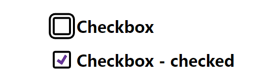
<form action="">
<label class="form-control">
<input type="checkbox" name="checkbox" />
Checkbox
</label>
<label class="form-control">
<input type="checkbox" name="checkbox-checked" checked />
Checkbox - checked
</label>
<label class="form-control form-control--disabled">
<input type="checkbox" name="checkbox-disabled" disabled />
Checkbox Disabled
</label>
<label class="form-control form-control--disabled">
<input type="checkbox" name="checkbox-disabled-checked" checked disabled />
Checkbox Disabled - checked
</label>
</form>
</body>
</html>
代码解释
1、未选中状态的CSS
input[type="checkbox"] {
  appearance: none;
  background-color: #fff;
  margin: 0;
  font: inherit;
  color: currentColor;
  width: 1.15em;
  height: 1.15em;
  border: 0.15em solid currentColor;
  border-radius: 0.15em;
  transform: translateY(-0.075em);
}

.form-control + .form-control {
  margin-top: 1em;
}
2、选中(checked)状态的CSS
input[type="checkbox"] {
  /* ...existing styles */
  display: grid;
  place-content: center;
}

input[type="checkbox"]::before {
  content: "";
  width: 0.65em;
  height: 0.65em;
  transform: scale(0);
  transition: 120ms transform ease-in-out;
  box-shadow: inset 1em 1em var(--form-control-color);
}

input[type="checkbox"]:checked::before {
  transform: scale(1);
}
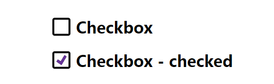
3、创建带有剪辑路径的选中标记
input[type="checkbox"]::before {
  /* ...existing styles */

  transform-origin: bottom left;
  clip-path: polygon(14% 44%, 0 65%, 50% 100%, 100% 16%, 80% 0%, 43% 62%);
}
4、:focus状态的CSS
input[type="checkbox"]:focus {
  outline: max(2px, 0.15em) solid currentColor;
  outline-offset: max(2px, 0.15em);
}
5、:disabled状态的CSS
:root {
  --form-control-disabled: #959495;
}

input[type="checkbox"]:disabled {
  --form-control-color: var(--form-control-disabled);

  color: var(--form-control-disabled);
  cursor: not-allowed;
}
.form-control--disabled {
color: var(--form-control-disabled);
cursor: not-allowed;
}
总结
本文介绍了两例纯CSS样式:单选radio/复选checkbox按钮,演示了如何使用额外的元素来达到预期的效果。
相关文章
相关文章
x


