好看的表单input输入框focus聚焦样式
作者:admin 时间:2022-12-7 13:40:14 浏览:网页设计中表单非常常见常用,一个好的表单样式能让更多访客产生好感,所以表单UI设计尤为重要。本文介绍一个好看的表单input输入框focus聚焦样式。
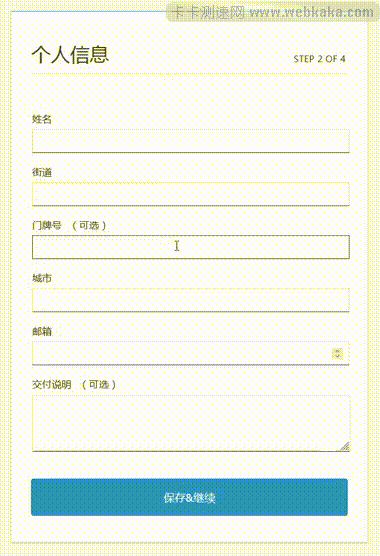
如上图看到,当鼠标点击表单input输入框时,输入框会通过亮色凸显起来,而整个表单form盒子也有一个阴影shadow显示效果。这种交互效果让人看了多了一份舒适的感觉。
下面是完整的HTML代码
<!DOCTYPE html>
<html>
<head>
  <meta charset="UTF-8">
  <meta name="viewport" content="width=device-width, initial-scale=1">

<style>
form:focus-within {
  box-shadow: 0px 0.2em 2.5em #c4c4c4;
  transform: scale(1.025);
}
@media screen and (prefers-reduced-motion: reduce) {
  form:focus-within {
    box-shadow: none;
    transform: none;
  }
}

body {
  background-color: #f8f8f8;
  color: #444444;
  font-family: "Open Sans";
  padding-bottom: 6em;
}

main {
  margin: 1.5em;
}
@media screen and (min-width: 35em) {
  main {
    margin: 3em;
  }
}

form {
  background-color: #ffffff;
  border-top: 1px solid #2491eb;
  border-right: 1px solid #e0e0e0;
  border-bottom: 1px solid #e0e0e0;
  border-left: 1px solid #e0e0e0;
  box-shadow: 0px 1px 1px #aaaaaa;
  display: block;
  max-width: 90vw;
  margin: 0 auto;
  padding: 3em 1.5em 0.5em 1.5em;
  transition: 250ms box-shadow ease-out, 250ms transform ease-out;
}
@media screen and (min-width: 35em) {
  form {
    max-width: 70vw;
    padding: 3em 2em 0.5em 2em;
  }
}

.form-header {
  border-bottom: 1px solid #e0e0e0;
  display: flex;
  flex-direction: column;
  margin-bottom: 2em;
  padding-bottom: 0.75em;
  width: 100%;
}
@media screen and (min-width: 26em) {
  .form-header {
    align-items: flex-end;
    justify-content: space-between;
    flex-direction: row;
  }
}
.form-header__title {
  font-weight: 300;
  margin: 0 0 0.5em 0;
  padding: 0;
}
@media screen and (min-width: 26em) {
  .form-header__title {
    margin: 0;
  }
}
.form-header__progress {
  font-size: 0.85em;
  letter-spacing: 0.05em;
  margin: 0;
  padding: 0 0.25em 0.25em 0;
  text-transform: uppercase;
}

.mailing {
  border: none;
  margin-bottom: 2em;
  padding: 0;
}
.mailing__title {
  font-size: 1.25em;
  font-weight: 300;
  margin-bottom: 1.5em;
  width: 100%;
}
.mailing .optional {
  font-variant: small-caps;
  letter-spacing: 0.025em;
  margin-left: 0.5em;
}

label {
  cursor: pointer;
  display: block;
  transition: 125ms color ease-out;
}
label:focus-within {
  color: #2491eb;
}

input[type=email],
input[type=text],
input[type=number],
textarea {
  -webkit-appearance: none;
     -moz-appearance: none;
          appearance: none;
  border: 1px solid #e0e0e0;
  border-bottom-color: #444444;
  border-radius: 0;
  display: block;
  line-height: 1;
  margin-top: 0.5em;
  margin-bottom: 1.5em;
  padding: 0.85em 0.75em 0.75em 0.75em;
  width: calc(100% - 1.25em);
  transition: 125ms border-color ease-out;
}
input[type=email]:hover,
input[type=text]:hover,
input[type=number]:hover,
textarea:hover {
  border-color: #444444;
}
input[type=email]:focus,
input[type=text]:focus,
input[type=number]:focus,
textarea:focus {
  border-color: #2491eb;
  outline: 1px solid #2491eb;
}

textarea {
  line-height: 1.5;
  margin-bottom: 0.5em;
  min-height: 4em;
  overflow: auto;
  resize: vertical;
}

input[type=submit] {
  background-color: #2491eb;
  border-radius: 0.25em;
  border: 1px solid #1277ca;
  color: #ffffff;
  font-size: 1.1em;
  letter-spacing: 0.025em;
  margin-top: 0.25em;
  margin-bottom: 2em;
  padding: 1em;
  transition: 125ms background-color ease-out, 125ms border-color ease-out;
  width: 100%;
}
input[type=submit]:focus {
  box-shadow: 0 0 0 3px #ffffff, 0 0 0 6px #2491eb;
  outline: none;
}
input[type=submit]:hover {
  background-color: #147fd8;
  border-color: #116cb7;
  text-decoration: underline;
}
input[type=submit]:active {
  background-color: #0e5896;
  border-color: #0b4575;
  position: relative;
  top: 1px;
  text-decoration: none;
  transition: none;
}
</style>

</head>

<body>
  <main>
  <form>
    <div class="form-header">
      <h1 class="form-header__title">个人信息</h1>
      <p class="form-header__progress">Step 2 of 4</p>
    </div>

    <fieldset class="mailing">
      <legend class="mailing__title"></legend>
        <label for="name">
          姓名
          <input required id="name" name="name" autocomplete="name" autocorrect="off" type="text" />
        </label>
        <label for="street-address">
          街道
          <input required id="street-address" name="street-address" autocomplete="street-address" autocorrect="off" type="text" />
        </label>
        <label for="address-line1">
          门牌号 <span class="optional">(可选)</span>
          <input id="address-line1" name="address-line1" autocomplete="address-line1" autocorrect="off" type="text" />
        </label>
        <label for="city">
          城市
          <input required novalidate="" id="city" name="city" autocomplete="shipping locality" autocapitalize="on" autocorrect="off" type="text" />
        </label>
        <label for="postal-code">
          邮箱
          <input required novalidate="" id="postal-code" name="postal-code" autocomplete="postal-code" autocorrect="off" type="number" />
        </label>

        <label for="delivery-instructions">
          交付说明 <span class="optional">(可选)</span>
          <textarea id="delivery-instructions" name="textarea" dir="auto"></textarea>
        </label>
    </fieldset>

    <input name="submit" type="submit" value="保存&继续" />
  </form>
</main>
</body>
</html>
代码解释
使用:focus选择器。
语法很简单。想要在用户点击时用橙色勾勒出轮廓,描述方法如下:
textarea:focus {
  outline: 1px solid orange;
}:focus是一个与其他选择器一样的选择器,它接受所有 CSS 属性。
我们可以改变输入框鼠标悬停及聚焦时的颜色:
input[type=email]:hover,
input[type=text]:hover,
input[type=number]:hover,
textarea:hover {
  border-color: #444444; /* 鼠标悬停输入框颜色 */
}
input[type=email]:focus,
input[type=text]:focus,
input[type=number]:focus,
textarea:focus {
  border-color: #2491eb; /* 鼠标聚焦输入框颜色 */
  outline: 1px solid #2491eb;  /* 鼠标聚焦输入框轮廓颜色 */
}
:focus-within
:focus-within是一个与焦点相关的伪类选择器,可以在其中一个子元素获得焦点时将样式应用于父元素。焦点事件冒泡,直到它遇到一个 CSS 规则要求它应用它的样式指令。
此选择器的一个常见用例是在其中一个输入元素获得焦点时将样式应用于整个表单。在本示例中,我稍微放大了整个表单的大小,给用户增加了一点动画体验,可以轻松修改阴影颜色及动画缩放。
form:focus-within {
  box-shadow: 0px 0.2em 2.5em #c4c4c4;
  transform: scale(1.025);
}
相关文章
相关文章
x


