纯CSS:两个非常漂亮的checkbox和radio按钮样式
作者:admin 时间:2022-12-6 20:52:28 浏览:前面介绍过两例纯CSS样式:单选radio/复选checkbox按钮,以及使用SVG实现的漂亮的复选框(checkbox)样式,今天,再给大家介绍两个非常漂亮的checkbox和radio按钮样式。
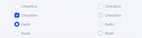
现在完全可以构建自定义复选框checkbox和单选radio按钮,同时保持语义和可访问性。我们甚至不需要一行 JavaScript 或额外的 HTML 元素!实际上现在比过去更容易了。让我们来看看。
完整HTML
<!DOCTYPE html>
<html>
<head>
  <meta charset="UTF-8">

<style>
@supports (-webkit-appearance: none) or (-moz-appearance: none) {
  input[type=checkbox],
input[type=radio] {
    --active: #275EFE;
    --active-inner: #fff;
    --focus: 2px rgba(39, 94, 254, .3);
    --border: #BBC1E1;
    --border-hover: #275EFE;
    --background: #fff;
    --disabled: #F6F8FF;
    --disabled-inner: #E1E6F9;
    -webkit-appearance: none;
    -moz-appearance: none;
    height: 21px;
    outline: none;
    display: inline-block;
    vertical-align: top;
    position: relative;
    margin: 0;
    cursor: pointer;
    border: 1px solid var(--bc, var(--border));
    background: var(--b, var(--background));
    transition: background 0.3s, border-color 0.3s, box-shadow 0.2s;
  }
  input[type=checkbox]:after,
input[type=radio]:after {
    content: "";
    display: block;
    left: 0;
    top: 0;
    position: absolute;
    transition: transform var(--d-t, 0.3s) var(--d-t-e, ease), opacity var(--d-o, 0.2s);
  }
  input[type=checkbox]:checked,
input[type=radio]:checked {
    --b: var(--active);
    --bc: var(--active);
    --d-o: .3s;
    --d-t: .6s;
    --d-t-e: cubic-bezier(.2, .85, .32, 1.2);
  }
  input[type=checkbox]:disabled,
input[type=radio]:disabled {
    --b: var(--disabled);
    cursor: not-allowed;
    opacity: 0.9;
  }
  input[type=checkbox]:disabled:checked,
input[type=radio]:disabled:checked {
    --b: var(--disabled-inner);
    --bc: var(--border);
  }
  input[type=checkbox]:disabled + label,
input[type=radio]:disabled + label {
    cursor: not-allowed;
  }
  input[type=checkbox]:hover:not(:checked):not(:disabled),
input[type=radio]:hover:not(:checked):not(:disabled) {
    --bc: var(--border-hover);
  }
  input[type=checkbox]:focus,
input[type=radio]:focus {
    box-shadow: 0 0 0 var(--focus);
  }
  input[type=checkbox],
input[type=radio] {
    width: 21px;
  }
  input[type=checkbox]:after,
input[type=radio]:after {
    opacity: var(--o, 0);
  }
  input[type=checkbox]:checked,
input[type=radio]:checked {
    --o: 1;
  }
  input[type=checkbox] + label,
input[type=radio] + label {
    font-size: 14px;
    line-height: 21px;
    display: inline-block;
    vertical-align: top;
    cursor: pointer;
    margin-left: 4px;
  }

  input[type=checkbox] {
    border-radius: 7px;
  }
  input[type=checkbox]:after {
    width: 5px;
    height: 9px;
    border: 2px solid var(--active-inner);
    border-top: 0;
    border-left: 0;
    left: 7px;
    top: 4px;
    transform: rotate(var(--r, 20deg));
  }
  input[type=checkbox]:checked {
    --r: 43deg;
  }

  input[type=radio] {
    border-radius: 50%;
  }
  input[type=radio]:after {
    width: 19px;
    height: 19px;
    border-radius: 50%;
    background: var(--active-inner);
    opacity: 0;
    transform: scale(var(--s, 0.7));
  }
  input[type=radio]:checked {
    --s: .5;
  }
}
ul {
  margin: 12px;
  padding: 0;
  list-style: none;
  width: 100%;
  max-width: 320px;
}
ul li {
  margin: 16px 0;
  position: relative;
}

html {
  box-sizing: border-box;
}

* {
  box-sizing: inherit;
}
*:before, *:after {
  box-sizing: inherit;
}

body {
  min-height: 100vh;
  font-family: "Inter", Arial, sans-serif;
  color: #8A91B4;
  display: flex;
  justify-content: center;
  align-items: center;
  background: #F6F8FF;
}
@media (max-width: 800px) {
  body {
    flex-direction: column;
  }
}
</style>


</head>

<body>
  <ul>
  <li>
    <input id="c1" type="checkbox">
    <label for="c1">Checkbox</label>
  </li>
  <li>
    <input id="c2" type="checkbox" checked>
    <label for="c2">Checkbox</label>
  </li>
  <li>
    <input id="r1" type="radio" name="radio" value="1">
    <label for="r1">Radio</label>
  </li>
  <li>
    <input id="r2" type="radio" name="radio" value="2" checked>
    <label for="r2">Radio</label>
  </li>
</ul>

<ul>
  <li>
    <input id="c1d" type="checkbox" disabled>
    <label for="c1d">Checkbox</label>
  </li>
  <li>
    <input id="c2d" type="checkbox" checked disabled>
    <label for="c2d">Checkbox</label>
  </li>
  <li>
    <input id="r1d" type="radio" name="radiod" value="1" disabled>
    <label for="r1d">Radio</label>
  </li>
  <li>
    <input id="r2d" type="radio" name="radiod" value="2" checked disabled>
    <label for="r2d">Radio</label>
  </li>
</ul>

</body>

</html>
下面我们看看这个HTML代码的实现方法。
1、HTML设计
我们可以只用这个 HTML 来设计我们的输入,没有什么特别的。
<!-- Checkbox -->
<input type="checkbox">

<!-- Radio -->
<input type="radio">
HTML 部分就这些了,当然还是推荐有 name 和 id 属性,加上一个匹配的<label>元素:
<!-- Checkbox -->
<input type="checkbox" name="c1" id="c1">
<label for="c1">Checkbox</label>

<!-- Radio -->
<input type="radio" name="r1" id="r1">
<label for="r1">Radio</label>
2、CSS样式
首先,我们检查appearance: none;的支持,包括它的前缀组成。appearance属性是关键,因为它旨在从元素中删除浏览器的默认样式。如果不支持该属性,则不会应用这些样式,并且会显示默认输入样式。这是渐进增强的一个很好的例子。
@supports(-webkit-appearance: none) or (-moz-appearance: none) {
input[type='checkbox'],
input[type='radio'] {
-webkit-appearance: none;
-moz-appearance: none;
}
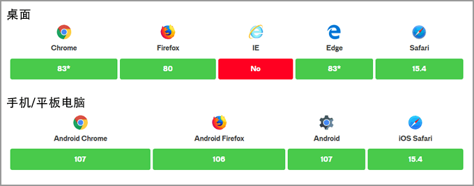
}就目前而言,支持的浏览器如下(数字表示支持浏览器该版本及更高版本):
3、元素交互状态设计
在设计元素时,我们会考虑这些交互状态:
- :checked
- :hover
- :focus
- :disabled
例如,以下是我们如何设置checkbox和radio的样式和:checked状态:
input[type=checkbox],
input[type=radio] {
    --active: #275EFE;
    --active-inner: #fff;
    --focus: 2px rgba(39, 94, 254, .3);
    --border: #BBC1E1;
    --border-hover: #275EFE;
    --background: #fff;
    --disabled: #F6F8FF;
    --disabled-inner: #E1E6F9;
    -webkit-appearance: none;
    -moz-appearance: none;
    height: 21px;
    outline: none;
    display: inline-block;
    vertical-align: top;
    position: relative;
    margin: 0;
    cursor: pointer;
    border: 1px solid var(--bc, var(--border));
    background: var(--b, var(--background));
    transition: background 0.3s, border-color 0.3s, box-shadow 0.2s;
  }
  input[type=checkbox]:after,
input[type=radio]:after {
    content: "";
    display: block;
    left: 0;
    top: 0;
    position: absolute;
    transition: transform var(--d-t, 0.3s) var(--d-t-e, ease), opacity var(--d-o, 0.2s);
  }
  input[type=checkbox]:checked,
input[type=radio]:checked {
    --b: var(--active);
    --bc: var(--active);
    --d-o: .3s;
    --d-t: .6s;
    --d-t-e: cubic-bezier(.2, .85, .32, 1.2);
  }
像<input>容器一样使用元素。input内部的旋钮是使用::after伪元素创建的,不再需要额外的标记!
4、自定义CSS属性
示例中,添加了一些 CSS 自定义属性,这是管理样式表中可重用值的好方法:
@supports(-webkit-appearance: none) or (-moz-appearance: none) {
  input[type='checkbox'],
  input[type='radio'] {
    --active: #275EFE;
    --active-inner: #fff;
    --focus: 2px rgba(39, 94, 254, .25);
    --border: #BBC1E1;
    --border-hover: #275EFE;
    --background: #fff;
    --disabled: #F6F8FF;
    --disabled-inner: #E1E6F9;
  }
}
自定义属性可以很好地根据元素的状态更新值!这里不打算做详细介绍,下面是一个示例,我们可以为不同的状态使用自定义属性。
/* 默认 */
input[type='checkbox'],
input[type='radio'] {
  --active: #275EFE;
  --border: #BBC1E1;
  border: 1px solid var(--bc, var(--border));
}

/* 覆盖默认 */
input[type='checkbox']:checked,
input[type='radio']:checked {
  --b: var(--active);
  --bc: var(--active);
}

/* 如果未选中或未禁用,则在悬停时应用另一种边框颜色 */
input[type='checkbox']:not(:checked):not(:disabled):hover,
input[type='radio']:not(:checked):not(:disabled):hover {
  --bc: var(--border-hover);
}
5、可访问性设计
对于可访问性,我们应该添加自定义焦点样式。删除默认轮廓,因为它不能像我们正在设计的其他东西一样圆润。但是 border-radius 和 box-shadow 可以形成一种圆形的样式,就像轮廓一样。
input[type='checkbox'],
input[type='radio'] {
  --focus: 2px rgba(39, 94, 254, .25);
  outline: none;
  transition: box-shadow .2s;
}

input[type='checkbox']:focus,
input[type='radio']:focus {
  box-shadow: 0 0 0 var(--focus);
}
也可以对直接跟在<input>后面的的<label>元素进行对齐并设置它的样式:
<input type="checkbox" name="c1" id="c1">
<label for="c1">Checkbox</label>
input[type='checkbox'] + label,
input[type='radio'] + label {
  display: inline-block;
  vertical-align: top;
  /* 附加样式 */
}

input[type='checkbox']:disabled + label,
input[type='radio']:disabled + label {
    cursor: not-allowed;
}
6、总结
由于直接在表单输入上的伪元素,它需要更少的标记。由于自定义属性,它需要更少花哨的样式切换。希望你也学会创建自定义表单样式。
相关文章


