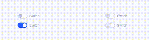
CSS示例:漂亮的切换开关(toggle switches)样式
作者:admin 时间:2022-12-7 1:30:59 浏览:本文介绍一个CSS示例:漂亮的切换开关(toggle switches)样式。
完整HTML代码
<!DOCTYPE html>
<html>
<head>
  <meta charset="UTF-8">

<style>
@supports (-webkit-appearance: none) or (-moz-appearance: none) {
  input[type=checkbox] {
    --active: #275EFE;
    --active-inner: #fff;
    --focus: 2px rgba(39, 94, 254, .3);
    --border: #BBC1E1;
    --border-hover: #275EFE;
    --background: #fff;
    --disabled: #F6F8FF;
    --disabled-inner: #E1E6F9;
    -webkit-appearance: none;
    -moz-appearance: none;
    height: 21px;
    outline: none;
    display: inline-block;
    vertical-align: top;
    position: relative;
    margin: 0;
    cursor: pointer;
    border: 1px solid var(--bc, var(--border));
    background: var(--b, var(--background));
    transition: background 0.3s, border-color 0.3s, box-shadow 0.2s;
  }
  input[type=checkbox]:after {
    content: "";
    display: block;
    left: 0;
    top: 0;
    position: absolute;
    transition: transform var(--d-t, 0.3s) var(--d-t-e, ease), opacity var(--d-o, 0.2s);
  }
  input[type=checkbox]:checked {
    --b: var(--active);
    --bc: var(--active);
    --d-o: .3s;
    --d-t: .6s;
    --d-t-e: cubic-bezier(.2, .85, .32, 1.2);
  }
  input[type=checkbox]:disabled {
    --b: var(--disabled);
    cursor: not-allowed;
    opacity: 0.9;
  }
  input[type=checkbox]:disabled:checked {
    --b: var(--disabled-inner);
    --bc: var(--border);
  }
  input[type=checkbox]:disabled + label {
    cursor: not-allowed;
  }
  input[type=checkbox]:hover:not(:checked):not(:disabled) {
    --bc: var(--border-hover);
  }
  input[type=checkbox]:focus {
    box-shadow: 0 0 0 var(--focus);
  }

  input[type=checkbox] + label {
    font-size: 14px;
    line-height: 21px;
    display: inline-block;
    vertical-align: top;
    cursor: pointer;
    margin-left: 4px;
  }


  input[type=checkbox].switch {
    width: 38px;
    border-radius: 11px;
  }
  input[type=checkbox].switch:after {
    left: 2px;
    top: 2px;
    border-radius: 50%;
    width: 15px;
    height: 15px;
    background: var(--ab, var(--border));
    transform: translateX(var(--x, 0));
  }
  input[type=checkbox].switch:checked {
    --ab: var(--active-inner);
    --x: 17px;
  }
  input[type=checkbox].switch:disabled:not(:checked):after {
    opacity: 0.6;
  }

}
ul {
  margin: 12px;
  padding: 0;
  list-style: none;
  width: 100%;
  max-width: 320px;
}
ul li {
  margin: 16px 0;
  position: relative;
}

html {
  box-sizing: border-box;
}

* {
  box-sizing: inherit;
}
*:before, *:after {
  box-sizing: inherit;
}

body {
  min-height: 100vh;
  font-family: "Inter", Arial, sans-serif;
  color: #8A91B4;
  display: flex;
  justify-content: center;
  align-items: center;
  background: #F6F8FF;
}
@media (max-width: 800px) {
  body {
    flex-direction: column;
  }
}
</style>

</head>

<body translate="no" >
<ul>
  <li>
    <input id="s1" type="checkbox" class="switch">
    <label for="s1">Switch</label>
  </li>
  <li>
    <input id="s2" type="checkbox" class="switch" checked>
    <label for="s2">Switch</label>
  </li>
</ul>

<ul>
  <li>
    <input id="s1d" type="checkbox" class="switch" disabled>
    <label for="s1d">Switch</label>
  </li>
  <li>
    <input id="s2d" type="checkbox" class="switch" checked disabled>
    <label for="s2d">Switch</label>
  </li>
</ul>


</body>

</html>
下面看看是如何设计代码的。
1、HTML
HTML 有 name 和 id 属性,加上一个匹配的<label>元素:
<input type="checkbox" class="switch" name="s1" id="s1">
<label for="s1">Switch</label>
2、CSS
使用了一个appearance属性,它旨在从元素中删除浏览器的默认样式。
@supports(-webkit-appearance: none) or (-moz-appearance: none) {
  input[type='checkbox'] {
    -webkit-appearance: none;
    -moz-appearance: none;
  }
}支持appearance属性的浏览器。
3、元素状态设计
下面我们设计元素的几个状态:
- :checked
- :hover
- :focus
- :disabled
例如,以下是:checked状态:
.switch {
  width: 38px;
  border-radius: 11px;
}

.switch::after {
  left: 2px;
  top: 2px;
  border-radius: 50%;
  width: 15px;
  height: 15px;
  background: var(--ab, var(--border));
  transform: translateX(var(--x, 0));
}

/* 改变checked时的颜色和位置 */
.switch:checked {
  --ab: var(--active-inner);
  --x: 17px;
}

/* 当input为disabled时,降低toggle透明度 */
.switch:disabled:not(:checked)::after {
  opacity: .6;
}<input>像容器一样使用元素,input内部的旋钮是使用::after伪元素创建的。
4、 CSS 自定义属性
定义了一些 CSS 自定义属性,因为这是管理样式表中可重用值的好方法:
@supports(-webkit-appearance: none) or (-moz-appearance: none) {
  input[type='checkbox'] {
    --active: #275EFE;
    --active-inner: #fff;
    --focus: 2px rgba(39, 94, 254, .25);
    --border: #BBC1E1;
    --border-hover: #275EFE;
    --background: #fff;
    --disabled: #F6F8FF;
    --disabled-inner: #E1E6F9;
  }
}
5、自定义焦点样式
添加自定义焦点样式,删除默认轮廓,因为它不够圆润。
input[type='checkbox'] {
  --focus: 2px rgba(39, 94, 254, .25);
  outline: none;
  transition: box-shadow .2s;
}

input[type='checkbox']:focus {
  box-shadow: 0 0 0 var(--focus);
}
6、总结
创建自定义表单样式好处多多,由于直接在表单输入上的伪元素,它需要更少的标记。由于自定义属性,它需要更少花哨的样式切换。
相关文章
标签: css toggle-switch 切换开关
相关文章
x


