纯CSS3实现的时间线 (Timeline),非常实用
作者:admin 时间:2020-7-12 10:49:7 浏览:时间线使用非常广泛,它可以比文字直述更加清晰明了的展示某一事物的历程。本文介绍纯CSS3实现的时间线 (Timeline),非常实用,难得的是代码使用起来也很简单。
纯CSS3实现的时间线 (Timeline)
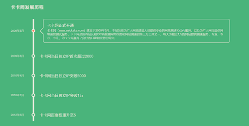
竖向时间线
时间线通常有竖向和横向两种呈现方式。本文将逐一介绍它们。我们先来看看竖向时间线。
竖向时间线
css代码
body {
  max-width: 1200px;
  margin: 0 auto;
  padding: 0 5%;
  font-size: 100%;
  font-family: "Noto Sans", sans-serif;
  color: #eee9dc;
  background: #48b379;
}

h2 {
  margin: 3em 0 0 0;
  font-size: 1.5em;
  letter-spacing: 2px;
  text-transform: uppercase;
}

/* -------------------------------------
 * timeline
 * ------------------------------------- */
#timeline {
  list-style: none;
  margin: 50px 0 30px 120px;
  padding-left: 30px;
  border-left: 8px solid #eee9dc;
}
#timeline li {
  margin: 40px 0;
  position: relative;
}
#timeline p {
  margin: 0 0 15px;
}

.date {
  margin-top: -10px;
  top: 50%;
  left: -158px;
  font-size: 0.95em;
  line-height: 20px;
  position: absolute;
}

.circle {
  margin-top: -10px;
  top: 50%;
  left: -44px;
  width: 10px;
  height: 10px;
  background: #48b379;
  border: 5px solid #eee9dc;
  border-radius: 50%;
  display: block;
  position: absolute;
}

.content {
  max-height: 20px;
  padding: 50px 20px 0;
  border-color: transparent;
  border-width: 2px;
  border-style: solid;
  border-radius: 0.5em;
  position: relative;
}
.content:before, .content:after {
  content: "";
  width: 0;
  height: 0;
  border: solid transparent;
  position: absolute;
  pointer-events: none;
  right: 100%;
}
.content:before {
  border-right-color: inherit;
  border-width: 20px;
  top: 50%;
  margin-top: -20px;
}
.content:after {
  border-right-color: #48b379;
  border-width: 17px;
  top: 50%;
  margin-top: -17px;
}
.content p {
  max-height: 0;
  color: transparent;
  text-align: justify;
  word-break: break-word;
  hyphens: auto;
  overflow: hidden;
}

label {
  font-size: 1.3em;
  position: absolute;
  z-index: 100;
  cursor: pointer;
  top: 20px;
  transition: transform 0.2s linear;
}

.radio {
  display: none;
}

.radio:checked + .relative label {
  cursor: auto;
  transform: translateX(42px);
}
.radio:checked + .relative .circle {
  background: #f98262;
}
.radio:checked ~ .content {
  max-height: 180px;
  border-color: #eee9dc;
  margin-right: 20px;
  transform: translateX(20px);
  transition: max-height 0.4s linear, border-color 0.5s linear, transform 0.2s linear;
}
.radio:checked ~ .content p {
  max-height: 200px;
  color: #eee9dc;
  transition: color 0.3s linear 0.3s;
}

/* -------------------------------------
 * mobile phones (vertical version only)
 * ------------------------------------- */
@media screen and (max-width: 767px) {
  #timeline {
    margin-left: 0;
    padding-left: 0;
    border-left: none;
  }
  #timeline li {
    margin: 50px 0;
  }

  label {
    width: 85%;
    font-size: 1.1em;
    white-space: nowrap;
    text-overflow: ellipsis;
    overflow: hidden;
    display: block;
    transform: translateX(18px);
  }

  .content {
    padding-top: 45px;
    border-color: #eee9dc;
  }
  .content:before, .content:after {
    border: solid transparent;
    bottom: 100%;
  }
  .content:before {
    border-bottom-color: inherit;
    border-width: 17px;
    top: -16px;
    left: 50px;
    margin-left: -17px;
  }
  .content:after {
    border-bottom-color: #48b379;
    border-width: 20px;
    top: -20px;
    left: 50px;
    margin-left: -20px;
  }
  .content p {
    font-size: 0.9em;
    line-height: 1.4;
  }

  .circle, .date {
    display: none;
  }
}
html代码
<ul id='timeline'>
<li class='work'>
<input class='radio' id='work5' name='works' type='radio' checked>
<div class="relative">
<label for='work5'>卡卡网正式开通</label>
<span class='date'>2009年5月</span>
<span class='circle'></span>
</div>
<div class='content'>
<p>
卡卡网(www.webkaka.com)建立于2009年5月,本站旨在为广大网站建设人员提供专业的网站测速和优化服务,以及为广大网民提供网络速度测试服务。
</p>
</div>
</li>
<li class='work'>
<input class='radio' id='work4' name='works' type='radio'>
<div class="relative">
<label for='work4'>卡卡网当日独立IP首次超过2000</label>
<span class='date'>2009年8月</span>
<span class='circle'></span>
</div>
<div class='content'>
<p>
卡卡网建立于2009年5月,本站旨在为广大网站建设人员提供专业的网站测速和优化服务,以及为广大网民提供网络速度测试服务。
</p>
</div>
</li>
</ul>
使用说明
- html使用
ul li列举标签,ul的id为timeline,li的类名为work - 时间节点使用
radio标签,添加checked属性可设置默认选择 - 标题、日期的div类名为
relative,内容的div类名为content
横向时间线
上面已经介绍了竖向时间线,这里继续介绍横向时间线。
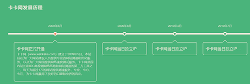
横向时间线
其实,横向时间线跟竖向时间线的html代码是一样的,使用方法也一样,只是它们的css代码不同而已。
css代码
body {
  margin: 0;
  padding: 0 5%;
  font-size: 100%;
  font-family: "Noto Sans", sans-serif;
  color: #eee9dc;
  background: #48b379;
}

h2 {
  margin: 3em 0 0 0;
  font-size: 1.5em;
  letter-spacing: 2px;
  text-transform: uppercase;
}

/* -------------------------------------
 * timeline
 * ------------------------------------- */
#timeline {
  list-style: none;
  margin: 120px 0 0;
  padding: 0;
  border-top: 8px solid #eee9dc;
  display: table;
  border-spacing: 30px 0;
}
#timeline li {
  display: table-cell;
}
#timeline li .relative {
  position: relative;
}
#timeline p {
  margin: 0 0 15px;
}

.date {
  text-align: center;
  top: -55px;
  left: 0;
  right: 0;
  font-size: 0.95em;
  line-height: 20px;
  position: absolute;
}

.circle {
  margin: 0 auto;
  top: -14px;
  left: 0;
  right: 0;
  width: 10px;
  height: 10px;
  background: #48b379;
  border: 5px solid #eee9dc;
  border-radius: 50%;
  display: block;
  position: absolute;
}

.content {
  width: 200px;
  max-height: 0;
  margin-top: 40px;
  vertical-align: top;
  padding: 50px 15px 15px;
  transition: width 0.4s linear, max-height 0.4s linear;
  border-width: 2px;
  border-style: solid;
  border-radius: 0.5em;
  position: relative;
}
.content:before, .content:after {
  content: "";
  width: 0;
  height: 0;
  border: solid transparent;
  position: absolute;
  pointer-events: none;
  bottom: 100%;
}
.content:before {
  border-bottom-color: inherit;
  border-width: 15px;
  left: 50%;
  margin-left: -15px;
}
.content:after {
  border-bottom-color: #48b379;
  border-width: 12px;
  left: 50%;
  margin-left: -12px;
}
.content p {
  max-height: 0;
  color: transparent;
  text-align: justify;
  word-break: break-word;
  hyphens: auto;
  overflow: hidden;
}

label {
  font-size: 1.3em;
  position: absolute;
  z-index: 100;
  cursor: pointer;
  width: 200px;
  white-space: nowrap;
  text-overflow: ellipsis;
  overflow: hidden;
  display: block;
  top: 60px;
  left: 15px;
}

.radio {
  display: none;
}

.radio:checked + .relative label {
  cursor: auto;
  width: 400px;
  transition: width 0.3s linear 0.2s;
}
.radio:checked + .relative .circle {
  background: #f98262;
}
.radio:checked ~ .content {
  max-height: 180px;
  border-color: #eee9dc;
  width: 400px;
}
.radio:checked ~ .content p {
  max-height: 200px;
  color: #eee9dc;
  transition: color 0.3s linear 0.3s;
}
html代码
跟上述竖向时间线的html代码一样,使用方法也一样。
相关文章
x


