CSS3背景图片填充文字【实例演示/源码下载】
作者:admin 时间:2022-3-17 16:40:7 浏览:本文介绍CSS3如何使用背景图片来填充文字,让文字变得更酷。
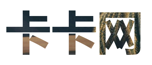
实例
<html>
<head>
<meta charset="utf-8" />
<title></title>
<style>
div {
  margin: auto;
  width: 800px;
  height: 300px;
  line-height: 300px;
  text-align: center;
  font-size: 150px;
  font-weight: bold;
  color:transparent;
  background: url(1.jpg);
  -webkit-background-clip: text;
}

</style>
</head>
<body>
  <div>
    卡卡网
  </div>
  <div>
    WebKaka
  </div>
</body>
</html>
代码解释
HTML文字使用一个DIV标签作为盒子。
CSS中使用了-webkit-background-clip: text; 和 color:transparent;,这两行关键的语句。
-webkit-background-clip: text; 的作用是把背景裁剪到文字,color:transparent; 是把文字颜色设为透明,这样文字颜色就是图片背景的裁剪部分。
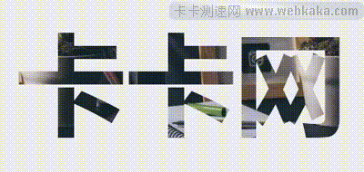
把文字背景做成动画效果
利用上面的案例,稍加改动,我们就可以把文字背景做成动画效果。
完整HTML代码
<html>

<head>
    <meta charset="utf-8" />
    <title></title>
    <style>
    div {
        margin: auto;
        width: 800px;
        height: 300px;
        line-height: 300px;
        text-align: center;
        font-size: 150px;
        font-weight: bold;
        color: transparent;
        background: url(1.jpg);
        -webkit-background-clip: text;
        animation: animate 8s ease 500ms infinite;
    }
    /* 定义关键帧 */

    @keyframes animate {
        from {
            background-size: 50%;
        }
        to {
            background-size: 20%;
        }
    </style>
</head>

<body>
    <div> 卡卡网 </div>
    <div> WebKaka </div>
</body>

</html>
代码解释
文字出现动画效果,是因为背景图片在移动,实现方法是使用css3的animation动画属性,本实例代码为 animation: animate 8s ease 500ms infinite; ,另外要加上对应的一个动画集 @keyframes animate {} 。
渐变文字效果
根据这种方法我们也可以做成渐变文字效果。

实例代码
<!DOCTYPE html>
<html>

<head>
<meta charset="utf-8" />
<title></title>
<style>
div {
  margin: auto;
  width: 800px;
  height: 300px;
  line-height: 300px;
  text-align: center;
  font-size: 150px;
  font-weight: bold;
  color: transparent;
  background: linear-gradient(90deg, #ffc700 0%, #e91e1e 50%, #6f27b0 100%);
  background-size: 200% 100%;
  background-position: 0 0;
  -webkit-background-clip: text;
  animation: bgposition 2s infinite linear alternate;
}

@keyframes bgposition {
  0% {
    background-position: 0 0;
  }
  100% {
    background-position: 100% 0;
  }
}
</style>
</head>
<body>
  <div>
    WebKaka
  </div>
</body>
</html>
代码解释
首先CSS使用background: linear-gradient()设置文字的背景是线性渐变颜色(静态)。
然后使用animation动画属性,设置背景位置(background-position)向右移动。
这样就做成了线性渐变效果的文字了。
相关文章
相关文章
x


