3行CSS代码实现文字镂空(动画)效果【演示/源码下载】
作者:admin 时间:2022-3-15 0:6:29 浏览:本文介绍如何用图片填充文字颜色,文字颜色用图片来填充,即是所说的文字镂空效果。
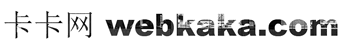
文字镂空效果
实例仅用CSS就能实现,且只有3行CSS代码。
完整HTML代码
<!DOCTYPE html>
<html>
<head>
    <meta charset="UTF-8">
    <meta name="viewport" content="width=device-width, initial-scale=1.0">
    <title>3行CSS代码实现用图片填充文字颜色</title>
    <style>
    div{
        font-family:"Arial Black", Helvetica, sans-serif, "宋体";
        font-size:65px;
        color: transparent;
        background-image: url("1.jpg");
        background-clip: text;
        /* 谷歌浏览器适配 */
        -webkit-background-clip: text;
    }
    </style>
</head>
<body>
    <div>卡卡网 webkaka.com</div>
</body>
</html>
代码分析
color: transparent;设置文字颜色为透明。
background-image: url("1.jpg");设置文字背景图片。
background-clip: text; 和 -webkit-background-clip: text; 意思是以盒子内的文字作为裁剪区域向外裁剪,文字之外的区域都将被裁剪掉。
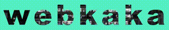
文字镂空动画效果
我们还可以把文字镂空做成动画效果
完整HTML代码
<!DOCTYPE html>
<html>

<head>
  <meta charset="UTF-8">
  <meta name="viewport" content="width=device-width, initial-scale=1.0">
  <title>文字镂空效果</title>
  <style>
    body {
      margin: 0;
      padding: 0;
      background-color: #55efc4;
    }

    h1.power {
      width: 100%;
      /* 没有做适配,直接按照全屏来的  也可以写px值  👇 */
      font-size: 150px;
      font-family:"Arial Black", Helvetica, sans-serif, "宋体";
      text-align: center;
      color: transparent;
      /* 文字间距 */
      letter-spacing: 20px;
      margin: 0;
      /* 居中h1标签 */
      position: fixed;
      left: 0;
      top: 50%;
      transform: translateY(-50%);
      /* 背景图片导入 */
      background: url("1.jpg") repeat center center;
      /* 背景裁切,值为text时 会有文字的镂空效果(前提是文字透明或者半透明,能直观看出来) */
      -webkit-background-clip: text;
      background-size: 40%;
      /* 动画执行 */
      animation: animate 8s ease 500ms infinite;
    }

    /* 定义关键帧 */
    @keyframes animate {
      from {
        background-size: 50%;
      }

      to {
        background-size: 10%;
      }
    }
  </style>
</head>

<body>
  <h1 class="power">webkaka</h1>
</body>

</html>
代码分析
本实例的文字镂空出现了动画效果是因为使用了下面的代码:
animation: animate 8s ease 500ms infinite;
/* 定义关键帧 */
@keyframes animate {
from {
background-size: 50%;
}
to {
background-size: 10%;
}
}
animation是css3的一个动画属性,其语法是:
animation: 动画名称 运动时间 运动曲线 等待时间 播放次数(无限播放) 是否反向播放
本实例里,动画名称是animate,运动时间是8s,运动曲线是ease(缓慢移动),等待时间是500ms,播放次数是infinite(无限)。
相关文章
x


