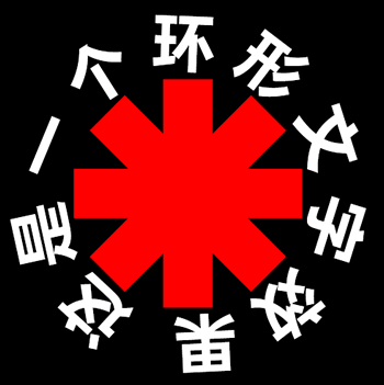
纯CSS实现环形文字效果
作者:admin 时间:2021-7-21 23:31:31 浏览:用纯CSS实现环形文字效果,相比用CSS实现其他文字效果要复杂一些,本文介绍如何用纯CSS实现环形文字效果。
纯CSS实现环形文字效果
本文介绍的方法中,需要用到SVG技术。
CSS代码
body {
  margin: 0;
  background: #000;
  text-align: center;
}

svg {
  width: 33%;
}

rect {
  fill: #FE0304;
}

text {
  font-size: 63px;
  font-family: FranklinGothic-Heavy, Frankin Gothic, sans-serif;
  font-weight: 900;
  text-transform: uppercase;
  letter-spacing: 21px;
  fill: white;
}
HTML代码
<svg xmlns="http://www.w3.org/2000/svg" xmlns:xlink="http://www.w3.org/1999/xlink" viewBox="0 0 500 500">
<defs>
<path d="M50,250c0-110.5,89.5-200,200-200s200,89.5,200,200s-89.5,200-200,200S50,360.5,50,250" id="textcircle">
<animateTransform
            attributeName="transform"
            begin="0s"
            dur="30s"
            type="rotate"
            from="0 250 250"
            to="360 250 250"
            repeatCount="indefinite"
/>
</path>
<symbol>
    <rect x="225" y="135" width="50" height="230" id="redstripe"/>
</symbol>
</defs>
<use xlink:href="#redstripe" />
<use xlink:href="#redstripe" transform="rotate(90 250 250)" />
<use xlink:href="#redstripe" transform="rotate(45 250 250)" />
<use xlink:href="#redstripe" transform="rotate(-45 250 250)" />
<text dy="70" textLength="1220">
        <textPath xlink:href="#textcircle">这是一个环形文字效果</textPath>
</text>
</svg>
代码解释
1、上面SVG代码,实现的环形文字,添加了文字转动的动画效果。如果不要文字转动,则可以把如下SVG代码去掉。
<animateTransform
    attributeName="transform"
    begin="0s"
    dur="30s"
    type="rotate"
    from="0 250 250"
    to="360 250 250"
    repeatCount="indefinite"
/>
2、此实例中,环形文字内容添加了一个图案,如果不要图案,那么可以把如下SVG代码去掉。
<symbol>
    <rect x="225" y="135" width="50" height="230" id="redstripe"/>
</symbol>
3、此环形文字是平均分布于一个圆周上,当文字个数减少时,文字间隔就宽一些。
4、可通过CSS代码里的 text 设置文字的颜色、大小等属性。
您可能对以下文章也感兴趣
相关文章
x


