强!纯CSS实现弹窗功能,不用JS
作者:admin 时间:2021-7-19 11:8:10 浏览:网页弹窗功能很常见,但一般是使用Javascript或jQuery来实现,而本文要介绍的是,使用纯CSS也能实现弹窗功能,不用JS。
纯CSS实现弹窗功能,不用JS
CSS代码
*,
*:after,
*:before {
  box-sizing: border-box;
}

body {
  font-family: "Inter", sans-serif;
  line-height: 1.5;
  min-height: 100vh;
  background-color: #f4f5f7;
  padding-top: 10vh;
  padding-bottom: 10vh;
}

strong {
  font-weight: 600;
}

article {
  width: 90%;
  max-width: 600px;
  margin-left: auto;
  margin-right: auto;
  font-size: 1.125rem;
  padding: 2rem;
  background-color: #fff;
  border-radius: 10px;
  box-shadow: 0 15px 20px -10px rgba(0, 0, 0, 0.1);
}
article > * + * {
  margin-top: 1em;
}
article:is(h1, h2, h3) + * {
  margin-top: 0.5em;
}
article h1 {
  font-weight: 900;
  font-size: 2rem;
  line-height: 1.125;
}
article code {
  background-color: #eee;
  font-weight: 600;
  font-family: monospace;
}
article ol {
  counter-reset: sickstuff;
}
article ol li {
  position: relative;
  padding-left: 32px;
  counter-increment: sickstuff;
}
article ol li + li {
  margin-top: 0.5em;
}
article ol li:before {
  content: counter(sickstuff);
  width: 24px;
  height: 24px;
  position: absolute;
  left: 0;
  top: calc((1.125rem * 1.5) - 24px);
  font-size: 0.75em;
  border-radius: 50%;
  display: inline-flex;
  align-items: center;
  justify-content: center;
  background-color: #185adb;
  color: #fff;
  font-weight: 600;
}

details {
  position: fixed;
  right: 1rem;
  bottom: 1rem;
  margin-top: 2rem;
  color: #6b7280;
  display: flex;
  flex-direction: column;
}
details div {
  background-color: #1e1e27;
  box-shadow: 0 5px 10px rgba(0, 0, 0, 0.15);
  padding: 1.25rem;
  border-radius: 8px;
  position: absolute;
  max-height: calc(100vh - 100px);
  width: 400px;
  max-width: calc(100vw - 2rem);
  bottom: calc(100% + 1rem);
  right: 0;
  overflow: auto;
  transform-origin: 100% 100%;
  color: #95a3b9;
}
details div::-webkit-scrollbar {
  width: 15px;
  background-color: #1e1e27;
}
details div::-webkit-scrollbar-thumb {
  width: 5px;
  border-radius: 99em;
  background-color: #95a3b9;
  border: 5px solid #1e1e27;
}
details div > * + * {
  margin-top: 0.75em;
}
details div p > code {
  font-size: 1rem;
  font-family: monospace;
}
details div pre {
  white-space: pre-line;
  border: 1px solid #95a3b9;
  border-radius: 6px;
  font-family: monospace;
  padding: 0.75em;
  font-size: 0.875rem;
  color: #fff;
}
details[open] div {
  -webkit-animation: scale 0.25s ease;
          animation: scale 0.25s ease;
}

summary {
  display: inline-flex;
  margin-left: auto;
  margin-right: auto;
  justify-content: center;
  align-items: center;
  font-weight: 600;
  padding: 0.75em 3em 0.75em 1.25em;
  border-radius: 99em;
  color: #fff;
  background-color: #185adb;
  box-shadow: 0 5px 15px rgba(0, 0, 0, 0.1);
  list-style: none;
  text-align: center;
  cursor: pointer;
  transition: 0.15s ease;
  position: relative;
}
summary::-webkit-details-marker {
  display: none;
}
summary:hover, summary:focus {
  background-color: #1348af;
}
summary svg {
  position: absolute;
  right: 1.25em;
  top: 50%;
  transform: translateY(-50%);
  width: 1.5em;
  height: 1.5em;
}

@-webkit-keyframes scale {
  0% {
    transform: scale(0);
  }
  100% {
    transform: scale(1);
  }
}

@keyframes scale {
  0% {
    transform: scale(0);
  }
  100% {
    transform: scale(1);
  }
}
HTML代码
<article>
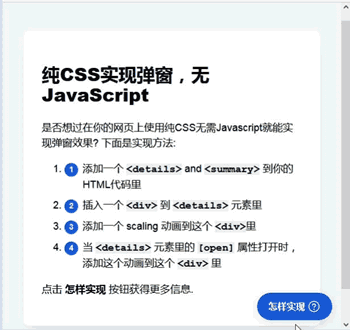
<h1>纯CSS实现弹窗,无JavaScript</h1>
<p>是否想过在你的网页上使用纯CSS无需Javascript就能实现弹窗效果? 下面是实现方法:</p>
<ol>
<li>添加一个 <code><details></code> and <code><summary></code> 到你的HTML代码里</li>
<li>插入一个 <code><div></code> 到 <code><details></code> 元素里</li>
<li>添加一个 scaling 动画到这个 <code><div></code>里</li>
<li>当 <code><details></code> 元素里的 <code>[open]</code> 属性打开时,添加这个动画到这个 <code><div></code> 里</li>
</ol>
<p>点击 <strong>怎样实现</strong> 按钮获得更多信息.</p>
</article>
<details>
<summary>怎样实现<svg xmlns="http://www.w3.org/2000/svg" width="192" height="192" fill="currentColor" viewBox="0 0 256 256"><rect width="256" height="256" fill="none"></rect><circle cx="128" cy="128" r="96" fill="none" stroke="currentColor" stroke-linecap="round" stroke-linejoin="round" stroke-width="16"></circle><circle cx="128" cy="180" r="12"></circle><path d="M127.9995,144.0045v-8a28,28,0,1,0-28-28" fill="none" stroke="currentColor" stroke-linecap="round" stroke-linejoin="round" stroke-width="16"></path></svg></summary>
<div>
<p>当你打开这个 <code><details></code> 元素时, scaling效果就通过使用keyframe动画创建.</p>
<p><pre><code>@keyframes scale {
0% {
transform: scale(0);
}
100% {
transform: scale(1);
}
}</code></pre> </p>
<p>这个动画添加到 <code><div></code> 里, 但只有当<code><details></code> 的 <code>[open]</code> 属性开关被打开时才有效。</p>
<p><pre><code>details[open] div {
animation: scale .15s ease;
}</code></pre></p>
</div>
</details>
代码解释
CSS
1、CSS <details> 元素和 <summary> 元素的 display 属性设为 flex 。此元素行为与块级元素相似,并根据弹性盒(Flexbox)模型布局其内容。单击即可切换此元素的弹性叠加层。
2、叠加层缩放效果通过使用keyframe动画创建。
@keyframes scale {
 0% {
  transform: scale(0);
 }
 100% {
  transform: scale(1);
 }
}
3、缩放动画添加到 <div> 里, 但只有当 <details> 的 [open] 属性开关被打开时才有效。
details[open] div {
 animation: scale .15s ease;
}
HTML
1、添加一个 <details> and <summary> 到你的HTML代码里。
2、插入一个 <div> 到 <details> 元素里
3、添加一个缩放动画到这个 <div> 里
4、添加这个动画到这个 <div> 里,但当 <details> 元素里的 [open] 属性打开时才有效。
相关文章
x


