CSS Loading 左右滚动加载动画等5实例【源码下载】
作者:admin 时间:2020-2-13 15:11:37 浏览:CSS Loading 加载动画常用于网页或应用程序加载提示,它比纯gif动画图片的优点在于不用占用文件体积,要知道一个复杂点的gif图标有可能达到100多KB,并且还有显示失真的问题。另外,css loading启动更快,循环轨迹更为平滑。因此现在的加载动画提示很少有人在用gif图片了,而是使用css loading加载动画提示。
本文将介绍5个CSS Loading 加载动画实例,还附上源码下载。
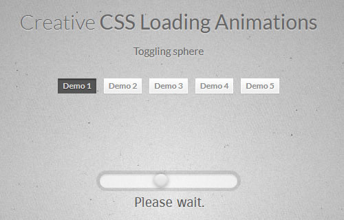
5个CSS Loading 加载动画实例
实例1
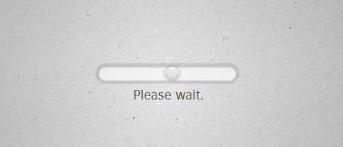
CSS Loading - 1
html代码
<!DOCTYPE html>
<html lang="en" class="demo-1">
<head>
<meta charset="UTF-8" />
<title>CSS Loading</title>
<script src="js/modernizr.custom.63321.js"></script>
<style type="text/css">

.demo-1 .bar {
    font-size: 20px;
    width: 10em;
    height: 1em;
    position: relative;
    margin: 100px auto;
    border-radius: .5em;
    background: rgba(255,255,255,0.6);
    box-shadow:
        0 0 0 .05em rgba(100,100,100,0.075),
        0 0 0 .25em rgba(0,0,0,0.1),
        inset 0 .1em .05em rgba(0,0,0,0.1),
        0 .05em rgba(255,255,255,0.7);
}

.demo-1 .bar:after {
    content: "Please wait.";
    position: absolute;
    left: 25%;
    top: 150%;
    font-family: 'Carrois Gothic', sans-serif;
    font-size: 1em;
    color: #555;
    text-shadow: 0 .05em rgba(255,255,255,0.7);
}

.demo-1 .bar .sphere {
    border-radius: 50%;
    width: 1em;
    height: 100%;
    background: -webkit-linear-gradient(#eee, #ddd);
    background: linear-gradient(#eee, #ddd);
    box-shadow:
        inset 0 .15em .1em rgba(255,255,255,0.3),
        inset 0 -.1em .15em rgba(0,0,0,0.15),
        0 0 .25em rgba(0,0,0,0.3);
    display: block;
    -webkit-animation: slide 1.75s ease-in-out infinite alternate;
    animation: slide 1.75s ease-in-out infinite alternate;
}

@-webkit-keyframes slide {
    from { }
    to { margin-left: 90%; }
}

@keyframes slide {
    from { }
    to { margin-left: 90%; }
}

</style>
</head>
<body>
<div class="bar">
<i class="sphere"></i>
</div>
</body>
</html>
实例2
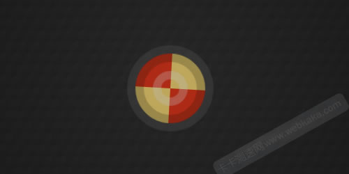
CSS Loading - 2
html代码
<!DOCTYPE html>
<html lang="en" class="demo-2">
<head>
<meta charset="UTF-8" />
<title>CSS Loading</title>
<script src="js/modernizr.custom.63321.js"></script>
<style type="text/css">


.demo-2 .spinner {
    position: relative;
    font-size: 100px;
    width: 1em;
    height: 1em;
    margin: 100px auto;
    border-radius: 50%;
    background: #123456;
    box-shadow: inset 0 0 0 .12em rgba(0,0,0,0.2), 0 0 0 .12em rgba(255,255,255,0.1);
    background:
        -webkit-linear-gradient(#ea2d0e 50%, #fcd883 50%),
        -webkit-linear-gradient(#fcd883 50%, #ea2d0e 50%);
    background:
        -webkit-linear-gradient(#ea2d0e 50%, #ffdd72 50%), -webkit-linear-gradient(#ffdd72 50%, #ea2d0e 50%);
    background:
        linear-gradient(#ea2d0e 50%, #ffdd72 50%),
        linear-gradient(#ffdd72 50%, #ea2d0e 50%);
    background-size: 50% 100%, 50% 100%;
    background-position: 0 0, 100% 0;
    background-repeat: no-repeat;
    opacity: 0.7;
    -webkit-animation: mask 3s infinite alternate;
    animation: mask 3s infinite alternate;
}

.demo-2 .spinner:after {
    content: "";
    position: absolute;
    border: .12em solid rgba(255,255,255,0.3);
    position: absolute;
    top: 25%;
    left: 25%;
    width: 50%;
    height: 50%;
    border-radius: inherit;
}

@-webkit-keyframes mask {
    0% { }
    25%  { -webkit-transform: rotate(270deg); }
    50%  { -webkit-transform: rotate( 90deg); }
    75%  { -webkit-transform: rotate(360deg); }
    100% { -webkit-transform: rotate(180deg); }
}

@keyframes mask {
    0% { }
    25%  { -webkit-transform: rotate(270deg); transform: rotate(270deg); }
    50%  { -webkit-transform: rotate( 90deg); transform: rotate( 90deg); }
    75%  { -webkit-transform: rotate(360deg); transform: rotate(360deg); }
    100% { -webkit-transform: rotate(180deg); transform: rotate(180deg); }
}


</style>
</head>
<body>
<section class="main">
<!-- the component -->
<div class="spinner"></div>
</section>
</body>
</html>
实例3
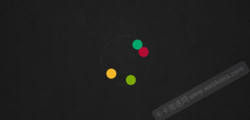
CSS Loading - 3
html代码
<!DOCTYPE html>
<html lang="en" class="demo-3">
<head>
<meta charset="UTF-8" />
<title>CSS Loading</title>
<script src="js/modernizr.custom.63321.js"></script>
<style type="text/css">

html { height: 100%; }

*,
*:after,
*:before {
-webkit-box-sizing: border-box;
-moz-box-sizing: border-box;
box-sizing: border-box;
padding: 0;
margin: 0;
}

.demo-3 .bokeh {
    font-size: 100px;
    width: 1em;
    height: 1em;
    position: relative;
    margin: 100px auto;
    border-radius: 50%;
    border: .01em solid rgba(150,150,150,0.1);
    list-style: none;
}

.demo-3 .bokeh li {
    position: absolute;
    width: .2em;
    height: .2em;
    border-radius: 50%;
}

.demo-3 .bokeh li:nth-child(1) {
    left: 50%;
    top: 0;
    margin: 0 0 0 -.1em;
    background: #00C176;
    -webkit-transform-origin: 50% 250%;
    transform-origin: 50% 250%;
    -webkit-animation:
        rota 1.13s linear infinite,
        opa 3.67s ease-in-out infinite alternate;
    animation:
        rota 1.13s linear infinite,
        opa 3.67s ease-in-out infinite alternate;
}

.demo-3 .bokeh li:nth-child(2) {
    top: 50%;
    right: 0;
    margin: -.1em 0 0 0;
    background: #FF003C;
    -webkit-transform-origin: -150% 50%;
    transform-origin: -150% 50%;
    -webkit-animation:
        rota 1.86s linear infinite,
        opa 4.29s ease-in-out infinite alternate;
    animation:
        rota 1.86s linear infinite,
        opa 4.29s ease-in-out infinite alternate;
}

.demo-3 .bokeh li:nth-child(3) {
    left: 50%;
    bottom: 0;
    margin: 0 0 0 -.1em;
    background: #FABE28;
    -webkit-transform-origin: 50% -150%;
    transform-origin: 50% -150%;
    -webkit-animation:
        rota 1.45s linear infinite,
        opa 5.12s ease-in-out infinite alternate;
    animation:
        rota 1.45s linear infinite,
        opa 5.12s ease-in-out infinite alternate;
}

.demo-3 .bokeh li:nth-child(4) {
    top: 50%;
    left: 0;
    margin: -.1em 0 0 0;
    background: #88C100;
    -webkit-transform-origin: 250% 50%;
    transform-origin: 250% 50%;
    -webkit-animation:
        rota 1.72s linear infinite,
        opa 5.25s ease-in-out infinite alternate;
    animation:
        rota 1.72s linear infinite,
        opa 5.25s ease-in-out infinite alternate;
}

@-webkit-keyframes rota {
    from { }
    to { -webkit-transform: rotate(360deg); }
}

@keyframes rota {
    from { }
    to { -webkit-transform: rotate(360deg); transform: rotate(360deg); }
}

@-webkit-keyframes opa {
    0% { }
    12.0% { opacity: 0.80; }
    19.5% { opacity: 0.88; }
    37.2% { opacity: 0.64; }
    40.5% { opacity: 0.52; }
    52.7% { opacity: 0.69; }
    60.2% { opacity: 0.60; }
    66.6% { opacity: 0.52; }
    70.0% { opacity: 0.63; }
    79.9% { opacity: 0.60; }
    84.2% { opacity: 0.75; }
    91.0% { opacity: 0.87; }
}

@keyframes opa {
    0% { }
    12.0% { opacity: 0.80; }
    19.5% { opacity: 0.88; }
    37.2% { opacity: 0.64; }
    40.5% { opacity: 0.52; }
    52.7% { opacity: 0.69; }
    60.2% { opacity: 0.60; }
    66.6% { opacity: 0.52; }
    70.0% { opacity: 0.63; }
    79.9% { opacity: 0.60; }
    84.2% { opacity: 0.75; }
    91.0% { opacity: 0.87; }
}


</style>
</head>
<body>
<section class="main">
<!-- the component -->
<ul class="bokeh">
<li></li>
<li></li>
<li></li>
<li></li>
</ul>
</section>
</body>
</html>
实例4
CSS Loading - 4
html代码
<!DOCTYPE html>
<html lang="en" class="demo-4">
<head>
<meta charset="UTF-8" />
<title>CSS Loading</title>
<script src="js/modernizr.custom.63321.js"></script>
<style type="text/css">


.demo-4 .wrapper {
    font-size: 25px; /* 1em */
    width: 8em;
    height: 8em;
    position: relative;
    margin: 100px auto;
    border-radius: 50%;
    background: rgba(255,255,255,0.1);
    border: 1em dashed rgba(138,189,195,0.5);
    box-shadow:
        inset 0 0 2em rgba(255,255,255,0.3),
        0 0 0 0.7em rgba(255,255,255,0.3);
    line-height: 6em;
    text-align: center;
    font-family: 'Racing Sans One', "HelveticaNeue-Light","Helvetica Neue Light","Helvetica Neue","Helvetica","Arial","Lucida Grande",sans-serif;
    color: #444;
    text-shadow: 0 .04em rgba(255,255,255,0.9);
    -webkit-animation: steam 3.5s linear infinite;
    animation: steam 3.5s linear infinite;
}

.demo-4 .wrapper:after,
.demo-4 .wrapper:before {
    content: "";
    position: absolute;
    left: 0; right: 0; top: 0; bottom: 0;
    z-index: -1;
    border-radius: inherit;
    box-shadow: inset 0 0 2em rgba(255,255,255,0.3);
    border: 1em dashed rgba(138,189,195,0.2);
}

.demo-4 .wrapper:before {
    top: 1em; bottom: 1em; right: 1em; left: 1em;
    border: 1em dashed rgba(138,189,195,0.4);
}

.demo-4 .inner {
    width: 100%;
    height: 100%;
    -webkit-animation: steam 3.5s linear reverse infinite;
    animation: steam 3.5s linear reverse infinite;
}

.demo-4 .inner span {
    display: inline-block;
    -webkit-animation: loading-1 1.5s ease-out infinite;
    animation: loading-1 1.5s ease-out infinite;
}

.demo-4 .inner span:nth-child(1)  {
    -webkit-animation-name: loading-1;
    animation-name: loading-1;
}

.demo-4 .inner span:nth-child(2)  {
    -webkit-animation-name: loading-2;
    animation-name: loading-2;
}

.demo-4 .inner span:nth-child(3)  {
    -webkit-animation-name: loading-3;
    animation-name: loading-3;
}

.demo-4 .inner span:nth-child(4)  {
    -webkit-animation-name: loading-4;
    animation-name: loading-4;
}

.demo-4 .inner span:nth-child(5)  {
    -webkit-animation-name: loading-5;
    animation-name: loading-5;
}

.demo-4 .inner span:nth-child(6)  {
    -webkit-animation-name: loading-6;
    animation-name: loading-6;
}

.demo-4 .inner span:nth-child(7)  {
    -webkit-animation-name: loading-7;
    animation-name: loading-7;
}

@-webkit-keyframes steam {
    from { }
    to { -webkit-transform: rotate(360deg); }
}

@keyframes steam {
    from { }
    to { -webkit-transform: rotate(360deg); transform: rotate(360deg); }
}

@-webkit-keyframes loading-1 {
    0% { }
    14.28% { opacity: 0.3; }
}

@-webkit-keyframes loading-2 {
    0% { }
    28.57% { opacity: 0.3; }
}

@-webkit-keyframes loading-3 {
    0% { }
    42.86% { opacity: 0.3; }
}

@-webkit-keyframes loading-4 {
    0% { }
    57.14% { opacity: 0.3; }
}

@-webkit-keyframes loading-5 {
    0% { }
    71.43% { opacity: 0.3; }
}

@-webkit-keyframes loading-6 {
    0% { }
    85.71% { opacity: 0.3; }
}

@-webkit-keyframes loading-7 {
    0% { }
    100% { opacity: 0.3; }
}

@keyframes loading-1 {
    0% { }
    14.28% { opacity: 0.3; }
}

@keyframes loading-2 {
    0% { }
    28.57% { opacity: 0.3; }
}

@keyframes loading-3 {
    0% { }
    42.86% { opacity: 0.3; }
}

@keyframes loading-4 {
    0% { }
    57.14% { opacity: 0.3; }
}

@keyframes loading-5 {
    0% { }
    71.43% { opacity: 0.3; }
}

@keyframes loading-6 {
    0% { }
    85.71% { opacity: 0.3; }
}

@keyframes loading-7 {
    0% { }
    100% { opacity: 0.3; }
}


</style>
</head>
<body>
<section class="main">
<!-- the component -->
<div class="wrapper">
<div class="inner">
<span>L</span>
<span>o</span>
<span>a</span>
<span>d</span>
<span>i</span>
<span>n</span>
<span>g</span>
</div>
</div>
</section>
</body>
</html>
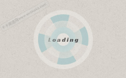
实例5

CSS Loading - 5
html代码
<!DOCTYPE html>
<html lang="en" class="demo-5">
<head>
<meta charset="UTF-8" />
<title>CSS Loading</title>
<script src="js/modernizr.custom.63321.js"></script>
<style type="text/css">


.demo-5 .pre-loader {
    font-size: 30px;
    width: 1em;
    height: 1em;
    border-radius: 50%;
    margin: 100px auto;
    position: relative;
    background: #123456;
    box-shadow:
       1em 1em #123456,
       2em 2em #123456,
       1em 3em #123456,
       0em 4em #123456,
      -1em 3em #123456,
      -2em 2em #123456,
      -1em 1em #123456;
    -webkit-transform-origin: 50% 250%;
    transform-origin: 50% 250%;
    -webkit-animation: blink 1s steps(1, start) infinite, counter-clock 8s linear infinite;
    animation: blink 1s steps(1, start) infinite, counter-clock 8s linear infinite;
}

.demo-5 .pre-loader:after {
    content: "";
    width: 3em;
    height: 3em;
    background: red;
    -webkit-transform: rotate(45deg);
    transform: rotate(45deg);
    position: absolute;
    background: white;
    background: rgba(255,255,255,0.6);
    left: -1em;
    top: 1em;
}

@-webkit-keyframes counter-clock {
    from { }
    to { -webkit-transform: rotate(-360deg); }
}

@keyframes counter-clock {
    from { }
    to { -webkit-transform: rotate(-360deg); transform: rotate(-360deg); }
}

@-webkit-keyframes blink {
    0% { }
    12.5% {
    background: rgba(18,52,86,0.6);
    box-shadow:
       1em 1em #123456,
       2em 2em #123456,
       1em 3em #123456,
       0em 4em #123456,
      -1em 3em #123456,
      -2em 2em #123456,
      -1em 1em #123456;
    }

    25% {
    background: #123456;
      box-shadow:
       1em 1em rgba(18,52,86,0.6),
       2em 2em #123456,
       1em 3em #123456,
       0em 4em #123456,
      -1em 3em #123456,
      -2em 2em #123456,
      -1em 1em #123456;
    }

    37.5% {
    background: #123456;
    box-shadow:
       1em 1em #123456,
       2em 2em rgba(18,52,86,0.6),
       1em 3em #123456,
       0em 4em #123456,
      -1em 3em #123456,
      -2em 2em #123456,
      -1em 1em #123456;
    }

    50% {
    background: #123456;
    box-shadow:
       1em 1em #123456,
       2em 2em #123456,
       1em 3em rgba(18,52,86,0.6),
       0em 4em #123456,
      -1em 3em #123456,
      -2em 2em #123456,
      -1em 1em #123456;
    }

    62.5% {
    background: #123456;
    box-shadow:
       1em 1em #123456,
       2em 2em #123456,
       1em 3em #123456,
       0em 4em rgba(18,52,86,0.6),
      -1em 3em #123456,
      -2em 2em #123456,
      -1em 1em #123456;
    }

    75% {
    background: #123456;
      box-shadow:
       1em 1em #123456,
       2em 2em #123456,
       1em 3em #123456,
       0em 4em #123456,
      -1em 3em rgba(18,52,86,0.6),
      -2em 2em #123456,
      -1em 1em #123456;
    }

    87.5% {
    background: #123456;
    box-shadow:
       1em 1em #123456,
       2em 2em #123456,
       1em 3em #123456,
       0em 4em #123456,
      -1em 3em #123456,
      -2em 2em rgba(18,52,86,0.6),
      -1em 1em #123456;
    }

    100% {
    background: #123456;
    box-shadow:
       1em 1em #123456,
       2em 2em #123456,
       1em 3em #123456,
       0em 4em #123456,
      -1em 3em #123456,
      -2em 2em #123456,
      -1em 1em rgba(18,52,86,0.6);
    }
}

@keyframes blink {
    0% { }
    12.5% {
    background: rgba(18,52,86,0.6);
    box-shadow:
       1em 1em #123456,
       2em 2em #123456,
       1em 3em #123456,
       0em 4em #123456,
      -1em 3em #123456,
      -2em 2em #123456,
      -1em 1em #123456;
    }

    25% {
    background: #123456;
      box-shadow:
       1em 1em rgba(18,52,86,0.6),
       2em 2em #123456,
       1em 3em #123456,
       0em 4em #123456,
      -1em 3em #123456,
      -2em 2em #123456,
      -1em 1em #123456;
    }

    37.5% {
    background: #123456;
    box-shadow:
       1em 1em #123456,
       2em 2em rgba(18,52,86,0.6),
       1em 3em #123456,
       0em 4em #123456,
      -1em 3em #123456,
      -2em 2em #123456,
      -1em 1em #123456;
    }

    50% {
    background: #123456;
    box-shadow:
      1em 1em #123456,
      2em 2em #123456,
      1em 3em rgba(18,52,86,0.6),
      0em 4em #123456,
      -1em 3em #123456,
      -2em 2em #123456,
      -1em 1em #123456;
    }

    62.5% {
    background: #123456;
    box-shadow:
       1em 1em #123456,
       2em 2em #123456,
       1em 3em #123456,
       0em 4em rgba(18,52,86,0.6),
      -1em 3em #123456,
      -2em 2em #123456,
      -1em 1em #123456;
    }

    75% {
    background: #123456;
      box-shadow:
       1em 1em #123456,
       2em 2em #123456,
       1em 3em #123456,
       0em 4em #123456,
      -1em 3em rgba(18,52,86,0.6),
      -2em 2em #123456,
      -1em 1em #123456;
    }

    87.5% {
    background: #123456;
    box-shadow:
       1em 1em #123456,
       2em 2em #123456,
       1em 3em #123456,
       0em 4em #123456,
      -1em 3em #123456,
      -2em 2em rgba(18,52,86,0.6),
      -1em 1em #123456;
    }

    100% {
    background: #123456;
    box-shadow:
       1em 1em #123456,
       2em 2em #123456,
       1em 3em #123456,
       0em 4em #123456,
      -1em 3em #123456,
      -2em 2em #123456,
      -1em 1em rgba(18,52,86,0.6);
    }
}

</style>
</head>
<body>
<section class="main">
<!-- the component -->
<div class="pre-loader"></div>
</section>
</body>
</html>
您可能对以下文章也感兴趣
标签: css css-loading 加载动画
相关文章
x


