用纯CSS实现各种方向的箭头【在线演示和源码下载】
作者:admin 时间:2019-9-5 16:51:43 浏览:在前文中介绍过纯CSS实现上下左右箭头,本文将扩展一下,介绍如何用纯CSS实现各种方向的箭头。
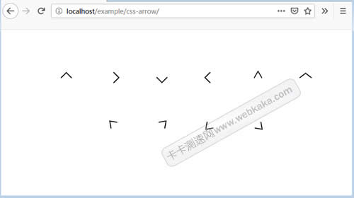
纯CSS实现各种方向的箭头
HTML标记
<ul>
<li><span class="arrow arrow-top"></span></li>
<li><span class="arrow arrow-right"></span></li>
<li><span class="arrow arrow-bottom"></span></li>
<li><span class="arrow arrow-left"></span></li>
<li><span class="arrow arrow-top-narrow"></span></li>
<li><span class="arrow arrow-top-wide"></span></li>
</ul>
<uL>
<li><span class="arrow arrow-top-left"></span></li>
<li><span class="arrow arrow-top-right"></span></li>
<li><span class="arrow arrow-bottom-left"></span></li>
<li><span class="arrow arrow-bottom-right"></span></li>
</ul>
CSS代码
ul {
margin: 1.5em 2em 1em;
text-align: center;
list-style: none;
}
ul + ul {
margin-top: -1em;
}
ul li {
display: inline-block;
margin: 40px;
}
/* arrow common style */
.arrow {
display: inline-block;
width: 15px;
height: 15px;
border-top: 2px solid #000;
border-right: 2px solid #000;
}
.arrow-top {
transform: rotate(-45deg);
}
.arrow-right {
transform: rotate(45deg);
}
.arrow-bottom {
transform: rotate(135deg);
}
.arrow-left {
transform: rotate(-135deg);
}
.arrow-top-narrow {
transform: rotate(-45deg) skew(-15deg, -15deg);
}
.arrow-top-wide {
transform: rotate(-45deg) skew(7deg, 7deg);
}
.arrow-top-left {
transform: rotate(-90deg) skew(-10deg, -10deg);
}
.arrow-top-right {
transform: rotate(0) skew(-10deg, -10deg);
}
.arrow-bottom-left {
transform: rotate(180deg) skew(-10deg, -10deg);
}
.arrow-bottom-right {
transform: rotate(90deg) skew(-10deg, -10deg);
}
设置箭头的粗细、大小和颜色
上面css代码中,可以通过.arrow类来设置箭头的粗细、大小和颜色,非常简单。
其中width和height是设置大小,border-top和border-right设置粗细和颜色。
.arrow {
display: inline-block;
width: 15px;
height: 15px;
border-top: 2px solid #000;
border-right: 2px solid #000;
}


