SVG实现的网页气泡动画效果
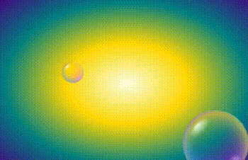
作者:admin 时间:2024-4-18 10:50:12 浏览:本文给大家介绍一个SVG实现的网页气泡动画效果。
HTML代码
<div class="demo">
  <div class="demo__content">

    <svg class="svg svg--defs">

        <!-- Bubble transparency -->
        <radialGradient id="grad--bw"
                        fx="25%" fy="25%">
            <stop offset="0%"
                  stop-color="black"/>
            <stop offset="30%"
                  stop-color="black"
                  stop-opacity=".2"/>
            <stop offset="97%"
                  stop-color="white"
                  stop-opacity=".4"/>
            <stop offset="100%"
                  stop-color="black"/>
        </radialGradient>

        <mask id="mask" maskContentUnits="objectBoundingBox">
            <rect fill="url(#grad--bw)"
              width="1" height="1"></rect>
        </mask>

        <!-- Light spot -->
        <radialGradient id="grad--spot"
                        fx="50%" fy="20%">
            <stop offset="10%"
                  stop-color="white"
                  stop-opacity=".7"/>
            <stop offset="70%"
                  stop-color="white"
                  stop-opacity="0"/>
        </radialGradient>

        <!-- Top & bottom light -->
        <radialGradient id="grad--bw-light"
                        _fx="25%" fy="10%">
            <stop offset="60%"
                  stop-color="black"
                  stop-opacity="0"/>
            <stop offset="90%"
                  stop-color="white"
                  stop-opacity=".25"/>
            <stop offset="100%"
                  stop-color="black"/>
        </radialGradient>

        <mask id="mask--light-top" maskContentUnits="objectBoundingBox">
            <rect fill="url(#grad--bw-light)"
              width="1" height="1" transform="rotate(180, .5, .5)"></rect>
        </mask>

        <mask id="mask--light-bottom" maskContentUnits="objectBoundingBox">
            <rect fill="url(#grad--bw-light)"
              width="1" height="1"></rect>
        </mask>

        <!-- Colors of bubble -->
        <linearGradient id="grad"
              x1="0" y1="100%" x2="100%" y2="0">
            <stop offset="0%" stop-color="dodgerblue"
                  class="stop-1"/>
            <stop offset="50%" stop-color="fuchsia"
                  class="stop-2"/>
            <stop offset="100%" stop-color="yellow"
                  class="stop-3"/>
        </linearGradient>

        <mask id="mask--collapse" maskContentUnits="objectBoundingBox">
            <circle r=".5" cx=".5" cy=".5"
                    class="collapse-circle"
                    ></circle>
        </mask>

        <symbol id="splash">
            <g class="splash__group"
               fill="none"
               stroke="white" stroke-opacity=".8">
                <circle r="49%"
                    cx="50%" cy="50%"
                    stroke-width="3%"
                    stroke-dasharray="1% 10%"
                    class="splash__circle _hidden"
                    ></circle>
                <circle r="44%"
                    cx="50%" cy="50%"
                    stroke-width="2%"
                    stroke-dasharray="1% 5%"                     class="splash__circle _hidden"
                    ></circle>
                <circle r="39%"
                    cx="50%" cy="50%"
                    stroke-width="1%"
                    stroke-dasharray="1% 8%"
                    class="splash__circle _hidden"
                    ></circle>
                <circle r="33%"
                    cx="50%" cy="50%"
                    stroke-width="3%"
                    stroke-dasharray="1% 6%"
                    class="splash__circle _hidden"
                    ></circle>
                <circle r="26%"
                    cx="50%" cy="50%"
                    stroke-width="1%"
                    stroke-dasharray="1% 7%"
                    class="splash__circle _hidden"
                    ></circle>
                <circle r="18%"
                    cx="50%" cy="50%"
                    stroke-width="1%"
                    stroke-dasharray="1% 8%"
                    class="splash__circle _hidden"
                    ></circle>
            </g>
        </symbol>
    </svg>

    <div class="demo__defs hidden">
        <svg class="svg bubble" viewBox="0 0 200 200">
            <g class="bubble__group">
              <ellipse rx="20%" ry="10%"
                   cx="150" cy="150"
                   fill="url(#grad--spot)"
                   transform="rotate(-225, 150, 150)"
                   class="shape _hidden"
                   ></ellipse>
              <circle r="50%"
                    cx="50%" cy="50%"
                    fill="aqua"
                    mask="url(#mask--light-bottom)"
                    class="shape _hidden"
                    ></circle>
              <circle r="50%"
                    cx="50%" cy="50%"
                    fill="yellow"
                    mask="url(#mask--light-top)"
                    class="shape _hidden"
                    ></circle>
              <ellipse rx="55" ry="25"
                   cx="55" cy="55"
                   fill="url(#grad--spot)"
                   transform="rotate(-45, 55, 55)"
                   class="shape _hidden"
                   ></ellipse>
              <circle r="50%"
                    cx="50%" cy="50%"
                    fill="url(#grad)"
                    mask="url(#mask)"
                    class="shape _hidden"
                    ></circle>
            </g>

            <use xlink:href="#splash" class="bubble__splash"/>

            </g>
        </svg>
    </div>

    <header class="demo__title demo-title">
        <svg class="svg demo-title__splash" viewBox="0 0 200 200">
            <use xlink:href="#splash"/>
        </svg>
    </header>
  </div>

</div>
CSS代码
HTML,
BODY {
  width: 100vw;
  height: 100vh;
}

BODY {
  background-color: lightyellow;
  background: radial-gradient(lightyellow, gold, teal, indigo);
}

.hidden {
  display: none;
}

.marked {
  outline: 2px solid red;
  stroke: red;
  stroke-width: 2;
}

.svg {
  position: absolute;
  width: 250px;
  height: 250px;
  overflow: visible;
  mix-blend-mode: multiply;
}

.svg--defs {
  width: 0;
  height: 0;
}

.demo {
  position: absolute;
  top: 0;
  right: 0;
  bottom: 0;
  left: 0;
  overflow: hidden;
  isolation: isolate;
}

.demo__title {
  position: absolute;
  right: 1rem;
  bottom: 1rem;
  text-shadow: 0 0 15px rgba(0, 0, 0, 0.5);
  font-family: "Mouse Memoirs", sans-serif;
  font-size: 4.9rem;
  color: #fff;
  cursor: pointer;
}

.demo-title__splash {
  position: absolute;
  top: -75px;
  left: -40px;
  opacity: 0;
  pointer-events: none;
}

.demo__tip {
  display: block;
  font-size: 1rem;
  font-family: Trebuchet MS;
}

.bubble {
  cursor: pointer;
}

.bubble__splash {
  opacity: 0;
  pointer-events: none;
}
JavaScript
本示例用到一个JavaScript插件TweenMax.js。
pen.js是本示例的JS编程文件。
<script src="TweenMax.min.js"></script>
<script src="pen.js"></script>
TweenMax.js 是一个JavaScript动画库,可以帮助开发人员进行编程动画。
总结
本文介绍了SVG实现的网页气泡动画效果,代码量比较多,另外还需用到一个JavaScript插件。不过效果还不错,斟酌使用。
相关文章
相关文章
x


