5款CSS设置漂亮好看的div边框图(border-image)样式
作者:admin 时间:2023-7-6 17:12:28 浏览:div的边框(border)不但可以设置其颜色,还可以使用图像来设置其样式。图片边框比纯色边框更加炫酷漂亮好看。本文将介绍5款CSS设置的漂亮好看的div边框图(border-image)样式。
CSS中的border-image属性
border-image 是定义边框的图像文件,它细分为几个属性:
- border-image-source: 边框图像文件地址
如:border-image-source: url('path/to/image.jpg'); - border-image-slice: 图像划分为多个区域
如:border-image-slice: 70; - border-image-width: 边框图像宽度
如:border-image-width: 40%; - border-image-repeat: 边框图像重复
如:border-image-repeat: repeat; - border-image-outset: 指定边框图像区域超出边框框的量
如:border-image-outset: 10px;
下面通过5个示例演示,让大家更好地理解和使用 border-image 属性。
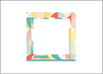
示例1
效果图
完整HTML代码
<!DOCTYPE html>
<html>
<head>
  <meta charset="UTF-8">
<style>
  .container {
    border-width: 2rem;
    border-style: dotted;
    border-color: grey;
    border-image-source: url("bg2.jpg");
    border-image-repeat: repeat;
    border-image-slice: 650 175;

    height: 250px;
    width: 250px;
  }
  body {
    display: grid;
    place-items: center;
    height: 100vh;
    background: #262626;
  }
</style>
</head>
<body>
  <div class="container"></div>
</body>
</html>
可以看到,HTML代码结构十分简单,只有一个div。而CSS代码也非常少,主要包含三个 border-image 属性:border-image-source、border-image-repeat和border-image-slice。
border-image-slice 属性本示例有2个参数值:650和175。是指上、下区域均为650,而左、右区域均为175。我们可以通过调整这两个参数值,看到边框图在相应地移动变化。
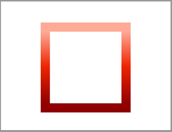
示例2
效果图
完整HTML代码
<!DOCTYPE html>
<html>
<head>
  <meta charset="UTF-8">
<style>
.container {
    --angle: 0deg;
    border-width: 2rem;
    border-style: dotted;
    border-color: grey;
    border-image-source: linear-gradient(
      var(--angle),
      #900000,
      #ee2400,
      #ffb09c 20rem
    );
    border-image-slice: 1;
    height: 250px;
    width: 250px;
    -webkit-animation: 10s rotate linear infinite;
            animation: 10s rotate linear infinite;
}
@-webkit-keyframes rotate {
    to {
      --angle: 360deg;
    }
}
@keyframes rotate {
    to {
      --angle: 360deg;
    }
}
@property --angle {
    syntax: "<angle>";
    initial-value: 0deg;
    inherits: false;
}
body {
    display: grid;
    place-items: center;
    height: 100vh;
}
</style>
</head>
<body>
  <div class="container"></div>
</body>
</html>
HTML代码结构与示例1一样。
本示例边框图(border-image)没有用到图像文件,而是实现了一个边框渐变的效果。
示例3
效果图

完整HTML代码
<!DOCTYPE html>
<html>
<head>
  <meta charset="UTF-8">
<style>
:root {
    --border-repeat: round;
    --border-style: ridge;
    --border-image-slice: 70;
}
body {
    display: flex;
    justify-content: center;
    align-items: center;
    height: 100vh;
    flex-wrap: wrap;
    background-color: #000000;
}
section{
    text-align: center;
    display: flex;
    width: 10rem;
    flex-wrap: nowrap;
    padding: 2rem;
    height: 10rem;
    justify-content: center;
}
.container {
    font-family: Georgia, 'Times New Roman', Times, serif;
    border-image-source: url('bg3.jpg');
    border-image-slice: var(--border-image-slice);
    border-image-repeat: var(--border-repeat);
    border-width: 2.5rem;
    border-color: grey;
    border-style: var(--border-style);
    transition: all 0.3s ease;
}
</style>
</head>
<body>
  <section class='container'></section>
</body>
</html>
HTML代码结构与前面的示例一样,这是一个炫酷好看的边框图像渐变的样式。
本示例设置 border-image-repeat: round; ,指定边框图像使用圆角平铺显示。
示例4
效果图
完整HTML代码
<!DOCTYPE html>
<html>
<head>
  <meta charset="UTF-8">
<style>
:root {
    --border-repeat: space;
    --border-style: ridge;
    --border-image-slice: 70;
}
body {
    display: flex;
    justify-content: center;
    align-items: center;
    height: 100vh;
    flex-wrap: wrap;
    background-color: #000000;
}
section{
    text-align: center;
    display: flex;
    width: 10rem;
    flex-wrap: nowrap;
    padding: 2rem;
    height: 10rem;
    justify-content: center;
}
.container {
    font-family: Georgia, 'Times New Roman', Times, serif;
    border-image-source: url('bg3.jpg');
    border-image-slice: var(--border-image-slice);
    border-image-repeat: var(--border-repeat);
    border-width: 2.5rem;
    border-color: grey;
    border-style: var(--border-style);
    transition: all 0.3s ease;
}
</style>
</head>
<body>
  <section class='container'></section>
</body>
</html>
HTML代码结构与前面的示例一样。
本示例设置 border-image-repeat: space; 属性,指定边框图像使用间隔平铺显示。
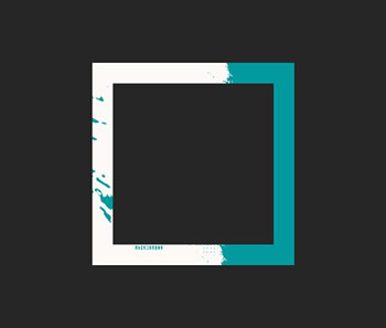
示例5
效果图
完整HTML代码
<!DOCTYPE html>
<html>
<head>
  <meta charset="UTF-8">
<style>
:root {
    --border-repeat: stretch;
    --border-style: ridge;
    --border-image-slice: 120;
    --border-image-width: 2.5rem;
}
body {
    display: flex;
    justify-content: center;
    align-items: center;
    height: 100vh;
    flex-wrap: wrap;
    background-color: #FDFEFE;
}
section{
    text-align: center;
    display: flex;
    width: 10rem;
    flex-wrap: nowrap;
    padding: 2rem;
    height: 10rem;
    align-items: center;
    justify-content: center;
}
.container {
    font-family: Georgia, 'Times New Roman', Times, serif;
    border-image-source: url('bg1.jpg');
    border-image-slice: var(--border-image-slice);
    border-image-repeat: var(--border-repeat);
    border-width: 2rem;
    border-image-width: var(--border-image-width);
    border-color: grey;
    border-style: var(--border-style);
    transition: all 0.3s ease;
}
</style>
</head>
<body>
  <section class='container'></section>
</body>
</html>
HTML代码结构与前面的示例一样。
本示例设置 border-image-repeat: stretch; 属性,指定边框图像使用拉伸平铺显示。
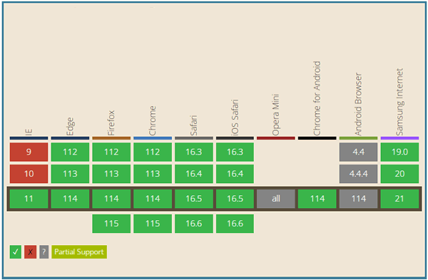
浏览器支持
总结
本文介绍了5款CSS设置漂亮好看的div边框图(border-image)样式,喜欢的朋友可以收藏本页,或直接下载源码备用。
相关文章


