CSS+JS实现的颜色渐变可拖动滑块
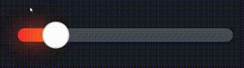
作者:admin 时间:2022-9-12 10:42:35 浏览:本文介绍一个CSS+JS实现的颜色渐变可拖动滑块。
实现代码
HTML
<form action="">
  <label for="gradient-range" class="sr">Range</label>
  <span class="gr-glow">
    <input id="gradient-range" class="gr-input" type="range" value="50" min="0" max="100">
  </span>
</form>
CSS
* {
  border: 0;
  box-sizing: border-box;
  margin: 0;
  padding: 0;
}

:root {
  --hue: 223;
  --white: hsl(var(--hue),10%,100%);
  --gray1: hsl(var(--hue),10%,90%);
  --gray2: hsl(var(--hue),10%,80%);
  --gray7: hsl(var(--hue),10%,30%);
  --gray9: hsl(var(--hue),10%,10%);
  font-size: calc(16px + (48 - 16) * (100vw - 320px) / (1280 - 320));
}

body,
input {
  font: 1em/1.5 sans-serif;
}

body {
  background-color: var(--gray9);
  color: var(--gray1);
  height: 100vh;
  display: grid;
  place-items: center;
}

/* Main styles */
.gr-glow {
  --gradient: linear-gradient(90deg,hsl(3,90%,55%),hsl(63,90%,55%) 6em,hsl(123,90%,55%) 12em);
  --percent: 50%;
  display: flex;
  align-items: center;
  position: relative;
  margin: 0.5em 0;
  width: 12em;
  height: 1.5em;
}

.gr-glow:before {
  background-image: var(--gradient);
  border-radius: 0.5em;
  content: "";
  display: block;
  filter: blur(0.6em);
  position: absolute;
  top: 25%;
  left: 0;
  width: var(--percent);
  height: 50%;
  z-index: -1;
}

.gr-input {
  background: var(--gray7) var(--gradient) no-repeat;
  background-size: var(--percent) 100%;
  border-radius: 0.5em;
  width: inherit;
  height: 0.75em;
  -webkit-appearance: none;
  appearance: none;
  -webkit-tap-highlight-color: transparent;
}

.gr-input:focus {
  outline: transparent;
}

/* WebKit */
.gr-input::-webkit-slider-thumb {
  background-color: var(--white);
  border: 0;
  border-radius: 50%;
  box-shadow: 0 0 0 0.0625em var(--gray2) inset;
  width: 1.5em;
  height: 1.5em;
  transition: background-color 0.15s linear;
  -webkit-appearance: none;
  appearance: none;
}

.gr-input:focus::-webkit-slider-thumb,
.gr-input::-webkit-slider-thumb:hover {
  background-color: var(--gray1);
}

/* Firefox */
.gr-input::-moz-range-thumb {
  background-color: var(--white);
  border: 0;
  border-radius: 50%;
  box-shadow: 0 0 0 0.0625em var(--gray2) inset;
  width: 1.5em;
  height: 1.5em;
  transition: background-color 0.15s linear;
}

.gr-input:focus::-moz-range-thumb,
.gr-input::-moz-range-thumb:hover {
  background-color: var(--gray1);
}

/* Acccessibility */
.sr {
  clip: rect(1px,1px,1px,1px);
  overflow: hidden;
  position: absolute;
  width: 1px;
  height: 1px;
}

/* `:focus-visible` support */
@supports selector(:focus-visible) {
  .gr-input:focus::-webkit-slider-thumb {
    background-color: var(--white);
  }

  .gr-input:focus-visible::-webkit-slider-thumb,
.gr-input::-webkit-slider-thumb:hover {
    background-color: var(--gray1);
  }

  .gr-input:focus::-moz-range-thumb {
    background-color: var(--white);
  }

  .gr-input:focus-visible::-moz-range-thumb,
.gr-input::-moz-range-thumb:hover {
    background-color: var(--gray1);
  }
}
JavaSCript
window.addEventListener("DOMContentLoaded", () =>
{
  const grs = new GradientRangeSlider("#gradient-range");
});
class GradientRangeSlider
{
  constructor(qs)
  {
    this.input = document.querySelector(qs);
    this.input ? .addEventListener("input", this.update.bind(this));
    this.update();
  }
  update(e)
  {
    let value = this.input.defaultValue;
    // when manually set
    if (e) value = e.target ? .value;
    // when initiated
    else this.input.value = value;
    const min = this.input.min || 0;
    const max = this.input.max || 100;
    const percentRaw = (value - min) / (max - min) * 100;
    const percent = +percentRaw.toFixed(2);
    const handle = 1.5 * (1 - percent / 100) - 1.125;
    const percentStyle = `calc(${percent}% + ${handle}em)`;
    this.input.parentElement ? .style.setProperty("--percent", percentStyle);
  }
}
相关文章
相关文章
x


