3个漂亮的纯CSS动画进度条
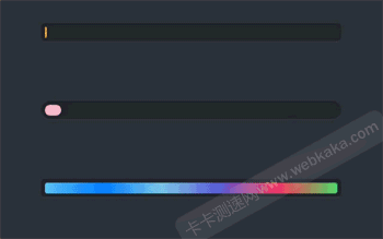
作者:admin 时间:2021-10-28 12:16:17 浏览:本文介绍3个漂亮的CSS动画进度条,它们都是用纯CSS来实现的,但进度条样式设计得很漂亮,值得推荐使用。
实例介绍
本实例的动画进度条,均用纯CSS来实现。
HTML代码只有两个DIV标签,使用三个CSS类。
HTML代码如下
<div class="container">
  <div class="progress progress-striped">
    <div class="progress-bar">
    </div>
  </div>
</div>

<div class="container">
  <div class="progress2 progress-moved">
    <div class="progress-bar2" >
    </div>
  </div>
</div>

<div class="container">
  <div class="progress progress-infinite">
    <div class="progress-bar3" >
    </div>
  </div>
</div>
每一个实例都使用三个CSS类,其中progress和progress2的作用是定义进度条的背景样式(边距、背景颜色、边角、阴影),代码为
.progress {
  padding: 6px;
  background: rgba(0, 0, 0, 0.25);
  border-radius: 6px;
  box-shadow: inset 0 1px 2px rgba(0, 0, 0, 0.25), 0 1px rgba(255, 255, 255, 0.08);
}
.progress2 {
  padding: 6px;
  border-radius: 30px;
  background: rgba(0, 0, 0, 0.25);
  box-shadow: inset 0 1px 2px rgba(0, 0, 0, 0.25), 0 1px rgba(255, 255, 255, 0.08);
}此外,每个实例都还使用另外两个不同的CSS类,实例1使用了progress-striped和progress-bar,实例2使用了progress-moved和progress-bar2,实例3使用了progress-infinite和progress-bar3,它们是进度条的主要代码,除了设置进度条样式,还设置动画。
完整CSS代码
body {
  font-family: "Montserrat", sans-serif;
  background: #2c303a;
}

.container {
  margin: 100px auto;
  width: 500px;
  text-align: center;
}

.progress {
  padding: 6px;
  background: rgba(0, 0, 0, 0.25);
  border-radius: 6px;
  box-shadow: inset 0 1px 2px rgba(0, 0, 0, 0.25), 0 1px rgba(255, 255, 255, 0.08);
}

.progress-bar {
  height: 18px;
  background-color: #ee303c;
  border-radius: 4px;
  transition: 0.4s linear;
  transition-property: width, background-color;
}

.progress-striped .progress-bar {
  background-color: #FCBC51;
  width: 100%;
  background-image: linear-gradient(45deg, #fca311 25%, transparent 25%, transparent 50%, #fca311 50%, #fca311 75%, transparent 75%, transparent);
  animation: progressAnimationStrike 6s;
}

@keyframes progressAnimationStrike {
  from {
    width: 0;
  }
  to {
    width: 100%;
  }
}
.progress2 {
  padding: 6px;
  border-radius: 30px;
  background: rgba(0, 0, 0, 0.25);
  box-shadow: inset 0 1px 2px rgba(0, 0, 0, 0.25), 0 1px rgba(255, 255, 255, 0.08);
}

.progress-bar2 {
  height: 18px;
  border-radius: 30px;
  background-image: linear-gradient(to bottom, rgba(255, 255, 255, 0.3), rgba(255, 255, 255, 0.05));
  transition: 0.4s linear;
  transition-property: width, background-color;
}

.progress-moved .progress-bar2 {
  width: 85%;
  background-color: #EF476F;
  animation: progressAnimation 6s;
}

@keyframes progressAnimation {
  0% {
    width: 5%;
    background-color: #F9BCCA;
  }
  100% {
    width: 85%;
    background-color: #EF476F;
  }
}
.progress-bar3 {
  height: 18px;
  border-radius: 4px;
  background-image: linear-gradient(to right, #4cd964, #5ac8fa, #007aff, #7DC8E8, #5856d6, #ff2d55);
  transition: 0.4s linear;
  transition-property: width, background-color;
}

.progress-infinite .progress-bar3 {
  width: 100%;
  background-image: linear-gradient(to right, #4cd964, #5ac8fa, #007aff, #7DC8E8, #5856d6, #ff2d55);
  animation: colorAnimation 1s infinite;
}

@keyframes colorAnimation {
  0% {
    background-image: linear-gradient(to right, #4cd964, #5ac8fa, #007aff, #7DC8E8, #5856d6, #ff2d55);
  }
  20% {
    background-image: linear-gradient(to right, #5ac8fa, #007aff, #7DC8E8, #5856d6, #ff2d55, #4cd964);
  }
  40% {
    background-image: linear-gradient(to right, #007aff, #7DC8E8, #5856d6, #ff2d55, #4cd964, #5ac8fa);
  }
  60% {
    background-image: linear-gradient(to right, #7DC8E8, #5856d6, #ff2d55, #4cd964, #5ac8fa, #007aff);
  }
  100% {
    background-image: linear-gradient(to right, #5856d6, #ff2d55, #4cd964, #5ac8fa, #007aff, #7DC8E8);
  }
}
总结
本文介绍了3个漂亮的动画进度条,代码简洁易理解,最主要的是它们都是纯CSS实现,这是大家喜欢的,也是值得推荐使用的主要原因。
您可能对以下文章也感兴趣
相关文章
x


