漂亮的CSS响应式定价表,无需第三方CSS库文件
作者:admin 时间:2023-3-6 20:25:29 浏览:我们在前面曾介绍过10多款CSS定价表,不过它们均需用到至少一个第三方CSS库文件,在本文中,将给大家介绍一个漂亮的CSS定价表,无需第三方CSS库文件。
在开始之前,你可以看看前面的那些CSS定价表,它们各种各样的样式或许有你喜欢的一款。
- 7款响应式CSS定价表(Pricing Table)【演示/源码】
- 3款响应式CSS定价表(Pricing Table)【演示/源码】
- 10款 CSS 定价表(Pricing Table)【实例演示/源码下载】
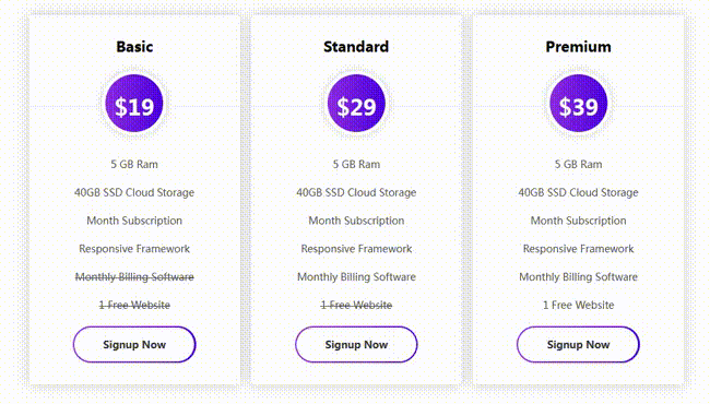
实例介绍
纯CSS实现定价表,这个定价表是响应式的,可以适用于任何设备上。
HTML代码
<div class="pricing-table gprice-single">
  <div class="head">
    <h4 class="title">Premium</h4>
  </div>
  <div class="content">
    <div class="price">
      <h1>$39</h1>
    </div>
    <ul>
      <li>5 GB Ram</li>
      <li>40GB SSD Cloud Storage</li>
      <li>Month Subscription</li>
      <li>Responsive Framework</li>
      <li>Monthly Billing Software</li>
      <li>1 Free Website</li>
    </ul>
    <div class="sign-up">
      <a href="#" class="btn bordered radius">Signup Now</a>
    </div>
  </div>
</div>
HTML代码结构并不复杂,外面一个div盒子,里面嵌套2层div。
标题(class="head")和内容(class="content")的div并列关系。
CSS代码
.wrapper {
  display: grid;
  grid-template-columns: repeat(3,1fr);
  grid-gap: 15px;
  margin: 50px;
  padding: 0px 20px;
}

.pricing-table {
  box-shadow: 0px 0px 18px #ccc;
  text-align: center;
  padding: 30px 0px;
  border-radius: 5px;
  position: relative;
}

.pricing-table .head {
  border-bottom: 1px solid #eee;
  padding-bottom: 50px;
  transition: all 0.5s ease;
}

.pricing-table:hover .head {
  border-bottom: 1px solid #8E2DE2;
}

.pricing-table .head .title {
  margin-bottom: 20px;
  font-size: 20px;
  font-weight: 700;
}

.pricing-table .content .price {
  background: linear-gradient(to right, #8E2DE2 0%, #4A00E0 100%);
  width: 90px;
  height: 90px;
  margin: auto;
  line-height: 90px;
  border-radius: 50%;
  border: 5px solid #fff;
  box-shadow: 0px 0px 10px #ccc;
  margin-top: -50px;
  transition: all 0.5s ease;
}

.pricing-table:hover .content .price {
  transform: scale(1.2);
}

.pricing-table .content .price h1 {
  color: #fff;
  font-size: 30px;
  font-weight: 700;
}

.pricing-table .content ul {
  list-style-type: none;
  margin-bottom: 20px;
  padding-top: 10px;
}

.pricing-table .content ul li {
  margin: 20px 0px;
  font-size: 14px;
  color: #555;
}

.pricing-table .content .sign-up {
  background: linear-gradient(to right, #8E2DE2 0%, #4A00E0 100%);
  border-radius: 40px;
  font-weight: 500;
  position: relative;
  display: inline-block;
}

.pricing-table .btn {
  color: #fff;
  padding: 14px 40px;
  display: inline-block;
  text-align: center;
  font-weight: 600;
  -webkit-transition: all 0.3s linear;
  -moz-transition: all 0.3 linear;
  transition: all 0.3 linear;
  border: none;
  font-size: 14px;
  text-transform: capitalize;
  position: relative;
  text-decoration: none;
  margin: 2px;
  z-index: 9999;
  text-decoration: none;
  border-radius: 50px;
}

.pricing-table .btn:hover {
  box-shadow: 0px 0px 15px rgba(0, 0, 0, 0.3);
}

.pricing-table .btn.bordered {
  z-index: 50;
  color: #333;
}

.pricing-table:hover .btn.bordered {
  color: #fff !important;
}

.pricing-table .btn.bordered:after {
  background: #fff none repeat scroll 0 0;
  border-radius: 50px;
  content: "";
  height: 100%;
  left: 0;
  position: absolute;
  top: 0;
  -webkit-transition: all 0.3s linear;
  -moz-transition: all 0.3 linear;
  transition: all 0.3 linear;
  width: 100%;
  z-index: -1;
  -webkit-transform: scale(1);
  -moz-transform: scale(1);
  transform: scale(1);
}

.pricing-table:hover .btn.bordered:after {
  opacity: 0;
  transform: scale(0);
}CSS代码主要对.pricing-table样式进行设计,有默认样式,盒子设计用到box-shadow等属性,也有鼠标悬停(:hover)样式,用到transform和transition动画属性。
总结
本文介绍的CSS定价表,它是响应式的,适用于任何设备上使用,无需第三方CSS库文件,CSS样式设计时没有用到非常高深的知识,理解起来比较容易,而由于无需用到第三方库文件,代码迁移和使用就变得非常方便。
相关文章
相关文章
x


