CSS动画背景-流星雨效果
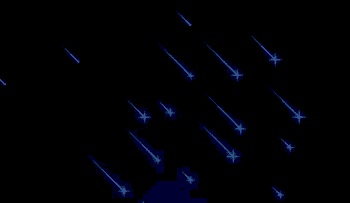
作者:admin 时间:2021-10-19 21:41:46 浏览:本文介绍一个流星雨效果的动画背景,它是纯CSS实现的,无需用到JavaScript,也无需用到第三方插件,喜欢的朋友可以直接复制代码使用,非常方便。
实例分析
HTML代码
<div class="night">
  <div class="shooting_star"></div>
  <div class="shooting_star"></div>
  <div class="shooting_star"></div>
  <div class="shooting_star"></div>
  <div class="shooting_star"></div>
  <div class="shooting_star"></div>
  <div class="shooting_star"></div>
  <div class="shooting_star"></div>
  <div class="shooting_star"></div>
  <div class="shooting_star"></div>
  <div class="shooting_star"></div>
  <div class="shooting_star"></div>
  <div class="shooting_star"></div>
  <div class="shooting_star"></div>
  <div class="shooting_star"></div>
  <div class="shooting_star"></div>
  <div class="shooting_star"></div>
  <div class="shooting_star"></div>
  <div class="shooting_star"></div>
  <div class="shooting_star"></div>
</div>
一共有20个<div class="shooting_star"></div>,一个shooting_star的div代表一颗流星。
.shooting_star {
  position: absolute;
  left: 50%;
  top: 50%;
  height: 2px;
  background: linear-gradient(-45deg, #5f91ff, rgba(0, 0, 255, 0));
  border-radius: 999px;
  filter: drop-shadow(0 0 6px #699bff);
  -webkit-animation: tail 3000ms ease-in-out infinite, shooting 3000ms ease-in-out infinite;
          animation: tail 3000ms ease-in-out infinite, shooting 3000ms ease-in-out infinite;
}
.shooting_star::before {
  content: "";
  position: absolute;
  top: calc(50% - 1px);
  right: 0;
  height: 2px;
  background: linear-gradient(-45deg, rgba(0, 0, 255, 0), #5f91ff, rgba(0, 0, 255, 0));
  transform: translateX(50%) rotateZ(45deg);
  border-radius: 100%;
  -webkit-animation: shining 3000ms ease-in-out infinite;
          animation: shining 3000ms ease-in-out infinite;
}
.shooting_star::after {
  content: "";
  position: absolute;
  top: calc(50% - 1px);
  right: 0;
  height: 2px;
  background: linear-gradient(-45deg, rgba(0, 0, 255, 0), #5f91ff, rgba(0, 0, 255, 0));
  transform: translateX(50%) rotateZ(45deg);
  border-radius: 100%;
  -webkit-animation: shining 3000ms ease-in-out infinite;
          animation: shining 3000ms ease-in-out infinite;
  transform: translateX(50%) rotateZ(-45deg);
}
每个流星出现的延迟时间,CSS:
.shooting_star:nth-child(1) {
  top: calc(50% - -4px);
  left: calc(50% - 248px);
  -webkit-animation-delay: 3060ms;
          animation-delay: 3060ms;
}
.shooting_star:nth-child(1)::before, .shooting_star:nth-child(1)::after {
  -webkit-animation-delay: 3060ms;
          animation-delay: 3060ms;
}从nth-child(1)到nth-child(20),animation-delay的值不同。
总结
本文介绍一个流星雨效果的动画背景,它是纯CSS实现的,无需用到JavaScript,也无需用到第三方插件,喜欢的朋友可以直接复制代码使用,非常方便。
您可能对以下文章也感兴趣
标签: 动画背景
相关文章
x


