CSS粒子动画背景
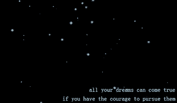
作者:admin 时间:2021-10-19 10:59:3 浏览:这是一个粒子动画,不需要 JavaScript 来构建它。这个背景的整个想法是让粒子随机移动。
实例分析
HTML代码
<div class="container">
  <div class="circle-container">
    <div class="circle"></div>
  </div>
  <div class="circle-container">
    <div class="circle"></div>
  </div>
</div>
每一个circle的div是一个圆,而circle-container是圆的位置。
.circle-container {
  position: absolute;
  transform: translateY(-10vh);
  -webkit-animation-iteration-count: infinite;
          animation-iteration-count: infinite;
  -webkit-animation-timing-function: linear;
          animation-timing-function: linear;
}
.circle-container .circle {
  width: 100%;
  height: 100%;
  border-radius: 50%;
  mix-blend-mode: screen;
  background-image: radial-gradient(#99ffff, #99ffff 10%, rgba(153, 255, 255, 0) 56%);
  -webkit-animation: fadein-frames 200ms infinite, scale-frames 2s infinite;
          animation: fadein-frames 200ms infinite, scale-frames 2s infinite;
}
圆的大小是直径为2px,位置是移动的,并且设定圆的显示时间、延迟时间。
.circle-container:nth-child(1) {
  width: 2px;
  height: 2px;
  -webkit-animation-name: move-frames-1;
          animation-name: move-frames-1;
  -webkit-animation-duration: 36060ms;
          animation-duration: 36060ms;
  -webkit-animation-delay: 32453ms;
          animation-delay: 32453ms;
}
@-webkit-keyframes move-frames-1 {
  from {
    transform: translate3d(68vw, 103vh, 0);
  }
  to {
    transform: translate3d(7vw, -110vh, 0);
  }
}
@keyframes move-frames-1 {
  from {
    transform: translate3d(68vw, 103vh, 0);
  }
  to {
    transform: translate3d(7vw, -110vh, 0);
  }
}
.circle-container:nth-child(1) .circle {
  -webkit-animation-delay: 1819ms;
          animation-delay: 1819ms;
}
您可能对以下文章也感兴趣
标签: 动画背景
相关文章
x


